Visualize Time-Series Data With Timescale and Grafana
Join the DZone community and get the full member experience.
Join For FreeGrafana is an open source analytics and monitoring solution often used to visualize time-series data. In this tutorial, you’ll learn how to:
- Setup Grafana and Timescale Cloud
- Use Grafana to visualize metrics stored in TimescaleDB
- Visualize geospatial data using Grafana
Setup Grafana and Timescale Cloud
First, you’ll want to setup Timescale Cloud. If you’d prefer to run your own instance of TimescaleDB, follow the installation instructions and the remainder of the tutorial should be fairly straightforward to follow.
If you’ve followed the setup instructions, you should have a working version of TimescaleDB with data preloaded. In our case, we will use the New York City taxicab data found in the Hello, Timescale! tutorial. Be sure to follow the full tutorial if you’re interested in background on how to use TimescaleDB.
If you’re using Timescale Cloud, you can setup a Grafana Metrics Dashboard from the Create Service flow.
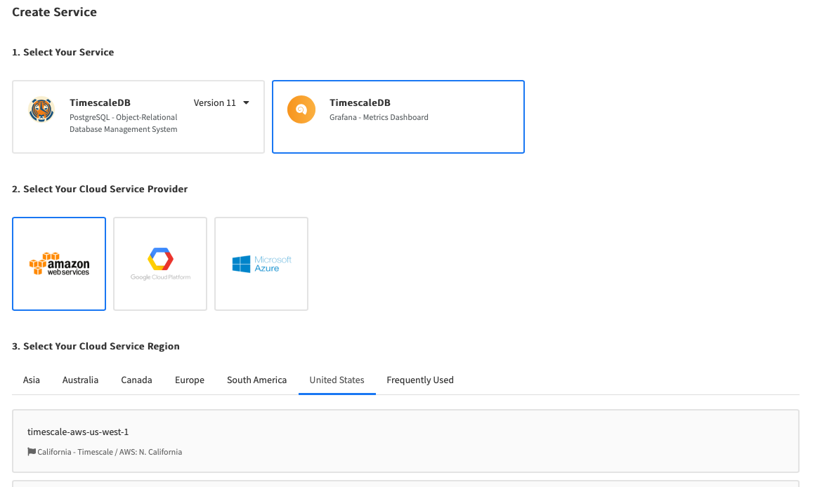
TIP:Alternatively, you can setup Grafana Cloud and follow the rest of the instructions below. Note that Grafana Cloud is more feature-rich than the open source version of Grafana included with Timescale Cloud, but does require a paid subscription from Grafana.
Finally, you need to configure Grafana to connect to your Timescale Cloud instance (or your own installation of TimescaleDB).
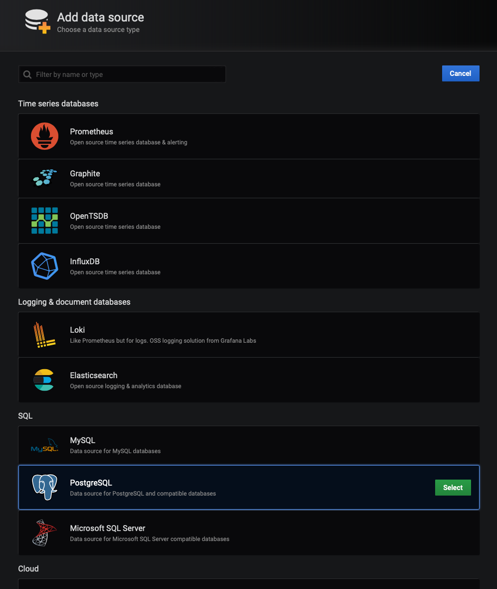
Start by selecting 'Add Data Source' and choosing the 'PostgreSQL' option in the SQL group:
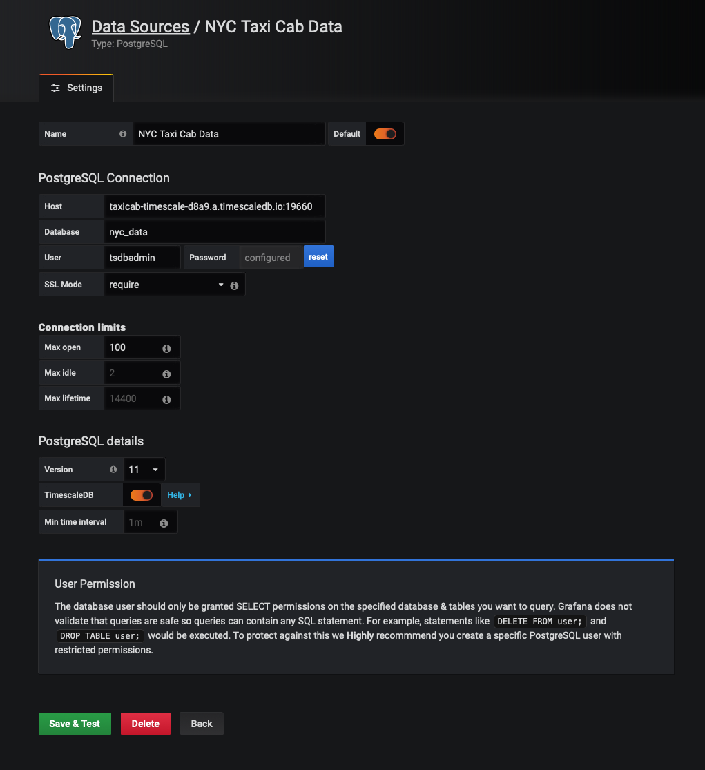
In the configuration screen, supply the Host, Database, User, and Password for your Timescale Cloud instance (or TimescaleDB server).
If you’re a Timescale Cloud user, you can see this in the Service Dashboard for your Timescale Cloud instance.
TIP:Don’t forget to add the port number after your host URI. For example,
hostname.timescaledb.io:19660. And don’t forget to change the database name, if necessary.
Since we will be connecting to a TimescaleDB instance (in Timescale Cloud) for this tutorial, we will also want to check the option for 'TimescaleDB' in the 'PostgreSQL details' section of the PostgreSQL configuration screen.
We will also change the 'Name' of the database to NYC Taxi Cab Data. This is optional, but will inform others who use our Grafana dashboard what this data source contains.
Once done, click 'Save & Test'. You should receive confirmation that your database connection is working.
Creating a Grafana Dashboard and Panel
Grafana is organized into ‘Dashboards’ and ‘Panels’. A dashboard represents a view onto the performance of a system, and each dashboard consists of one or more panels, which represents information about a specific metric related to that system.
We will start by creating a new dashboard. In the far left of the Grafana user interface, you’ll see a '+' icon. If you hover over it, you’ll see a 'Create' menu, within which is a 'Dashboard' option. Select that 'Dashboard' option.
After creating a new dashboard, you’ll see a 'New Panel' screen, with options for 'Add Query' and 'Choose Visualization'. In the future, if you already have a dashboard with panels, you can click on the '+' icon at the top of the Grafana user interface, which will enable you to add a panel to an existing dashboard.
To proceed with our tutorial, let’s add a new visualization by clicking on the 'Choose Visualization' option.
At this point, you’ll have several options for different Grafana visualizations. We will choose the first option, the 'Graph' visualization.
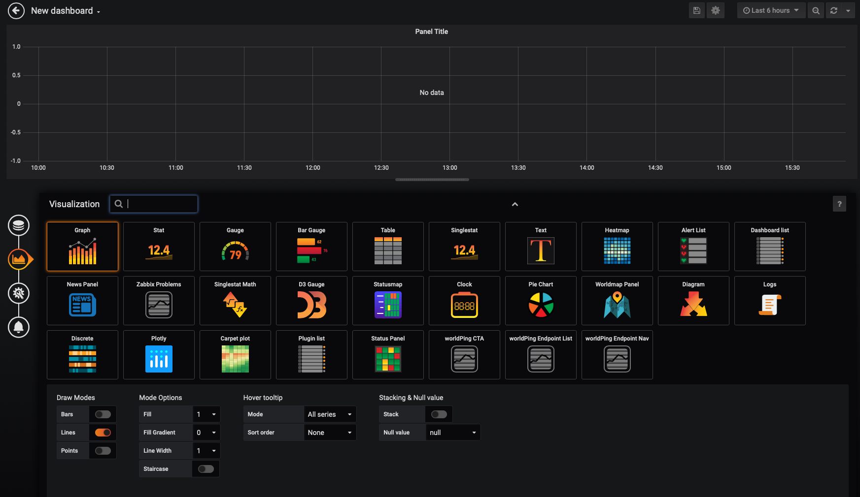
There are multiple ways to configure our panel, but we will accept all the defaults and create a simple 'Lines' graph.
In the far left section of the Grafana user interface, select the 'Queries' tab.

Instead of using the Grafana query builder, we will edit our query directly. In the view, click on the 'Edit SQL' button at the bottom.

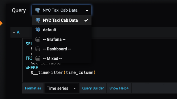
Before we can begin authoring our query, we also want to set the Query database to the New York City taxi cab datasource we connected to earlier:
Visualize metrics stored in TimescaleDB
Let’s start by creating a visualization that answers the question How many rides took place on each day? from the Hello, Timescale! tutorial.
From the tutorial, you can see the standard SQL syntax for our query:
xxxxxxxxxx
SELECT date_trunc('day', pickup_datetime) AS day,
COUNT(*)
FROM rides
GROUP BY day
ORDER BY day;
We will need to alter this query to support Grafana’s unique query syntax.
Modifying the SELECT statement
First, we will modify the date_trunc function to use the TimescaleDB time_bucket function. You can consult the TimescaleDB API Reference on time_bucket for more information on how to use it properly.
Let’s examine the SELECT portion of this query. First, we will bucket our results into one day groupings using the time_bucket function. If you set the 'Format' of a Grafana panel to be 'Time series', for use in Graph panel for example, then the query must return a column named time that returns either a SQL datetime or any numeric datatype representing a Unix epoch.
So, part 1 of this new query is modified so that the output of the time_bucket grouping is labeled time as Grafana requires, while part 2 is unchanged:
SELECT
--1--
time_bucket('1 day', pickup_datetime) AS "time",
--2--
COUNT(*)
FROM rides
The Grafana __timeFilter function
Grafana time-series panels include a tool that enables the end-user to filter on a given time range. A “time filter,” if you will. Not surprisingly, Grafana has a way to link the user interface construct in a Grafana panel with the query itself. In this case, the $__timefilter() function.
In the modified query below, we will use the $__timefilter() function to set the pickup_datetime column as the filtering range for our visualizations.
xxxxxxxxxx
SELECT
--1--
time_bucket('1 day', pickup_datetime) AS "time",
--2--
COUNT(*)
FROM rides
WHERE $__timeFilter(pickup_datetime)
Referencing elements in our query
Finally, we want to group our visualization by the time buckets we’ve selected, and we want to order the results by the time buckets as well. So, our GROUP BY and ORDER BY statements will reference time.
With these changes, this is our final Grafana query:
xxxxxxxxxx
SELECT
--1--
time_bucket('1 day', pickup_datetime) AS time,
--2--
COUNT(*)
FROM rides
WHERE $__timeFilter(pickup_datetime)
GROUP BY time
ORDER BY time
When we visualize this query in Grafana, we see the following:

TIP:Remember to set the time filter in the upper right corner of your Grafana dashboard. If you're using the pre-built sample dataset for this example, you will want to set your time filter around January 1st, 2016.
Currently, the data is bucketed into 1 day groupings. Adjust the time_bucket function to be bucketed into 5 minute groupings instead and compare the graphs:
xxxxxxxxxx
SELECT
--1--
time_bucket('5m', pickup_datetime) AS time,
--2--
COUNT(*)
FROM rides
WHERE $__timeFilter(pickup_datetime)
GROUP BY time
ORDER BY time
When we visualize this query, it will look like this:

Visualize geospatial data stored in TimescaleDB
The NYC Taxi Cab data also contains the location of each ride pickup. In the Hello, Timescale! Tutorial, we examined rides that originated near Times Square. Let’s build on that query and visualize rides whose distance traveled was greater than five miles in Manhattan.
We can do this in Grafana using the 'Worldmap Panel'. We will start by creating a new panel, selecting 'New Visualization', and selecting the 'Worldmap Panel'.
Once again, we will edit our query directly. In the Query screen, be sure to select your NYC Taxicab Data as the data source. In the 'Format as' dropdown, select 'Table'. Click on 'Edit SQL' and enter the following query in the text window:
xxxxxxxxxx
SELECT time_bucket('5m', rides.pickup_datetime) AS time,
rides.trip_distance AS value,
rides.pickup_latitude AS latitude,
rides.pickup_longitude AS longitude
FROM rides
WHERE $__timeFilter(rides.pickup_datetime) AND
ST_Distance(pickup_geom,
ST_Transform(ST_SetSRID(ST_MakePoint(-73.9851,40.7589),4326),2163)
) < 2000
GROUP BY time,
rides.trip_distance,
rides.pickup_latitude,
rides.pickup_longitude
ORDER BY time
LIMIT 500;
Let’s dissect this query. First, we’re looking to plot rides with visual markers that denote the trip distance. Trips with longer distances will get different visual treatments on our map. We will use the trip_distance as the value for our plot. We will store this result in the value field.
In the second and third lines of the SELECT statement, we are using the pickup_longitude and pickup_latitude fields in the database and mapping them to variables longitude and latitude, respectively.
In the WHERE clause, we are applying a geospatial boundary to look for trips within 2000m of Times Square.
Finally, in the GROUP BY clause, we supply the trip_distance and location variables so that Grafana can plot data properly.
WARNING:This query may take a while, depending on the speed of your Internet connection. This is why we’re using the
LIMITstatement for demonstration purposes.
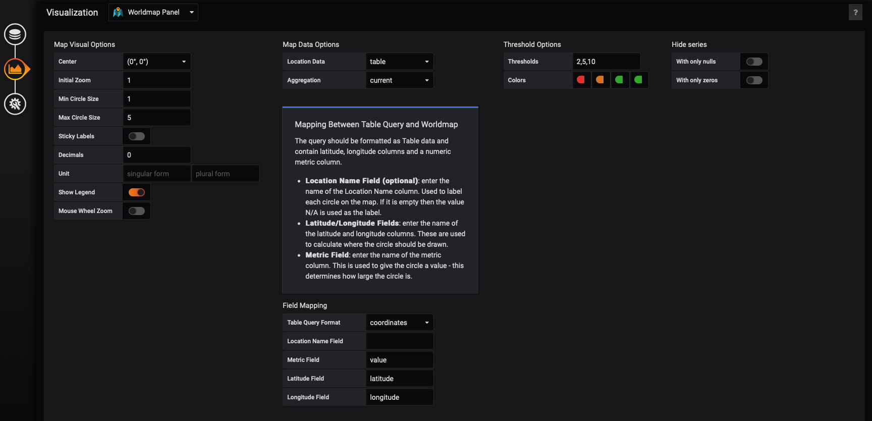
Now let’s configure our Worldmap visualization. Select the 'Visualization' tab in the far left of the Grafana user interface. You’ll see options for 'Map Visual Options', 'Map Data Options', and more.
First, make sure the 'Map Data Options' are set to 'table' and 'current'. Then in the 'Field Mappings' section. We will set the 'Table Query Format' to be ‘Table’. We can map the 'Latitude Field' to our latitude variable, the 'Longitude Field' to our longitude variable, and the 'Metric' field to our value variable.
In the 'Map Visual Options', set the 'Min Circle Size' to 1 and the 'Max Circle Size' to 5.
In the 'Threshold Options' set the 'Thresholds' to '2,5,10'. This will auto configure a set of colors. Any plot whose value is below 2 will be a color, any value between 2 and 5 will be another color, any value between 5 and 10 will be a third color, and any value over 10 will be a fourth color.
Your configuration should look like this:
At this point, data should be flowing into our Worldmap visualization, like so:

You should be able to edit the time filter at the top of your visualization to see trip pickup data for different timeframes.
Using Grafana variables
Our goal here will be to create a variable which controls the type of ride displayed in the visual, based on the payment type used for the ride.
There are several types of payments, which we can see in the payment_types table:
xxxxxxxxxx
payment_type | description
--------------+-------------
1 | credit card
2 | cash
3 | no charge
4 | dispute
5 | unknown
6 | voided trip
(6 rows)
Grafana includes many types of variables, and variables in Grafana function just like variables in programming languages. We define a variable, and then we can reference it in our queries.
Define a new Grafana variable
To create a new variable, go to your Grafana dashboard settings, navigate to the 'Variable' option in the side-menu, and then click the 'Add variable' button.
In this case, we use the 'Query' type, where our variable will be defined as the results of SQL query.
Under the 'General' section, we’ll name our variable payment_type and give it a type of Query. Then, we’ll assign it the label of “Payment Type", which is how it will appear in a drop-down menu.
We will select our data source and supply the query:
SELECT payment_type FROM payment_types;Turn on 'Multi-value' and 'Include All option'. This will enable users of your dashboard to select more than one payment type. Our configuration should look like this:
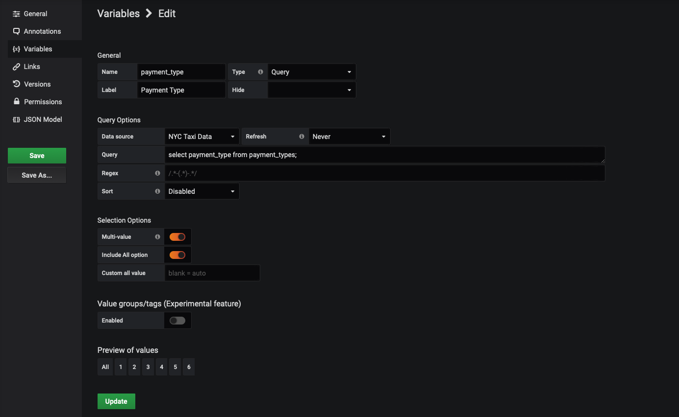
Click 'Add' to save your variable.
Use the variable in a Grafana panel
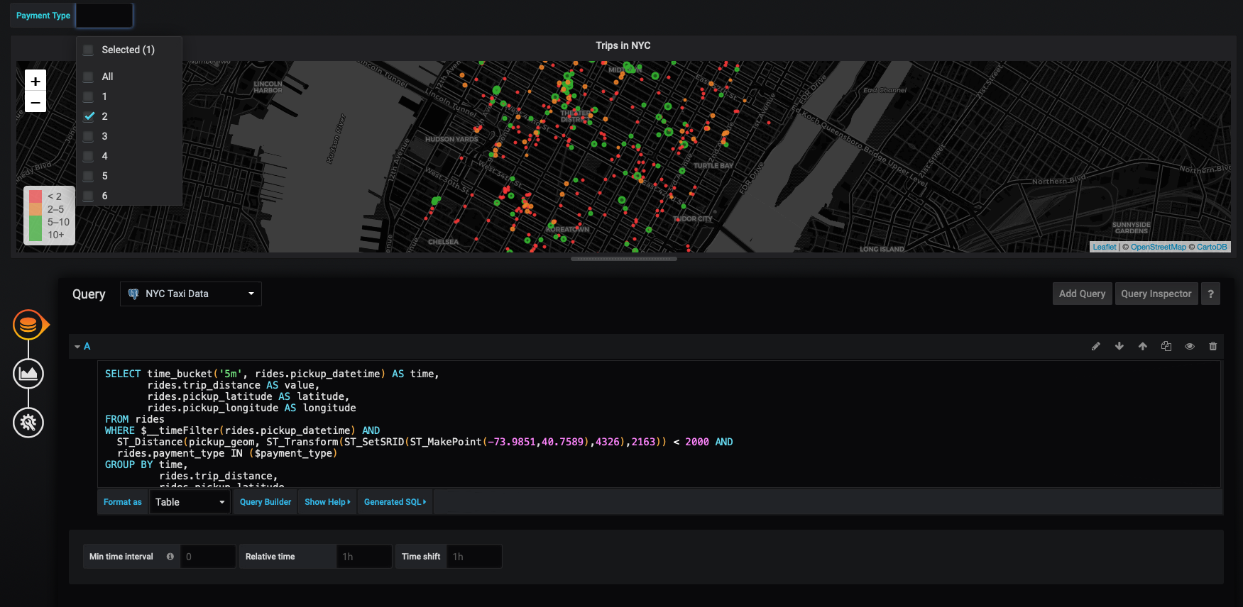
Let's edit the WorldMap panel we created in the previous section. The first thing you'll notice is that now that we've defined a variable for this dashboard, there's now a drop-down for that variable in the upper left hand corner of the panel.
We can use this variable to filter the results of our query using the WHERE clause in SQL. We will check and see if rides.payment_type is in the array of the variable, which we've named $payment_type.
Let's modify our earlier query like so:
xxxxxxxxxx
SELECT time_bucket('5m', rides.pickup_datetime) AS time,
rides.trip_distance AS value,
rides.pickup_latitude AS latitude,
rides.pickup_longitude AS longitude
FROM rides
WHERE $__timeFilter(rides.pickup_datetime) AND
ST_Distance(pickup_geom,
ST_Transform(ST_SetSRID(ST_MakePoint(-73.9851,40.7589),4326),2163)
) < 2000 AND
rides.payment_type IN ($payment_type)
GROUP BY time,
rides.trip_distance,
rides.pickup_latitude,
rides.pickup_longitude
ORDER BY time
LIMIT 500;
Now we can use the drop-down to filter our rides based on the type of payment used:
Improving the Grafana filter to be human readable
But this filter isn't very attractive. We can't tell what '1' means. Fortunately, when we set up our NYC Taxi Cab dataset, we created a payment_types table (which we queried earlier). The payment_types.description field has a more readable explanation of what each payment code means, for example, 'credit card', 'cash', and so on. Those readable descriptions are what we want in our drop-down.
Click 'Dashboard settings' (the "gear" icon in the upper-right of your Grafana visualizations). Select the 'Variables' tab on the left, and click the $payment_types variable. Modify your query to retrieve the description and store it in the __text field and retrieve the payment_type and store it in the __value field, like so:
xxxxxxxxxx
SELECT description AS "__text", payment_type AS "__value" FROM payment_types
Your configuration should look like this now:
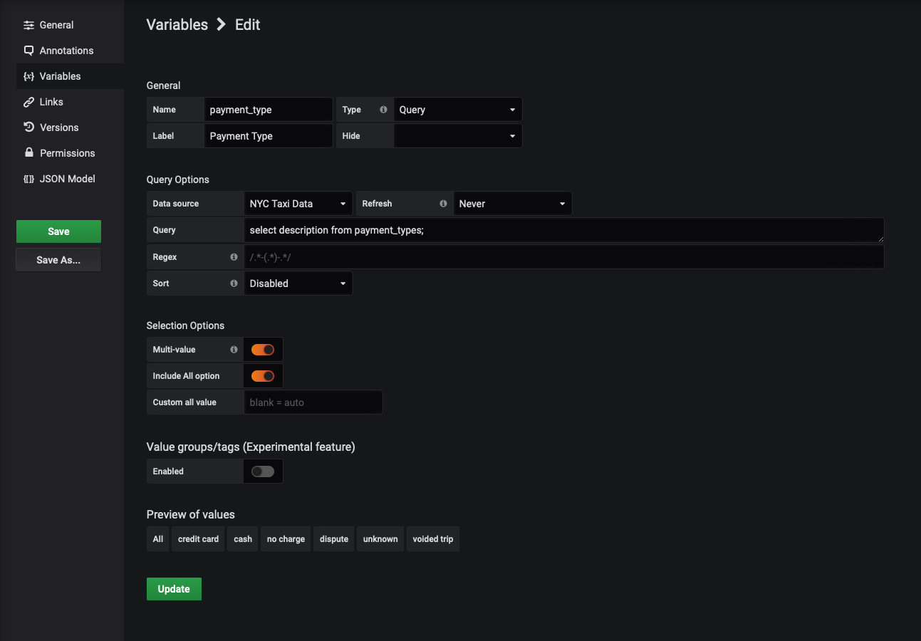
There's no need to alter the query for the WorldMap visualization itself. Whatever database column is assigned as __text is used whenever the variable is displayed and whatever is assigned to __value is used as the actual value when Grafana makes a query.
As you can see, a variable can be used in a query in much the same way you'd use a variable in any programming language.
Published at DZone with permission of Prashant Sridharan. See the original article here.
Opinions expressed by DZone contributors are their own.

Comments