Types of Matplotlib in Python
In this article, take a look at some types of Matplotlib in Python.
Join the DZone community and get the full member experience.
Join For FreeThe data visualizations are the graphical representation of data which produces the images to map the relationships among the data values. There are many visualization tools in the market which can generate automated charts or graphs by collecting the data from various sources. Python is a very simple programming language which is widely used in the market for carrying the data science work to meet the business needs. Python has got its own packages for displaying the charts or graphs.
Matplotlib in Python is a package that is used for displaying the 2D graphics. The Matplotlib can be used in python scripts, shell, web application servers and other GUI toolkits. Python provides different types of plots such as Bar Graph, Histogram, Scatterplot, Area plot, Pie plot for viewing the data. Let us now discuss these types of Matplotlib in detail.
1. Bar Graph Using Matplotlib
The bar graphs are used in data comparison where we can measure the changes over a period of time. It can be represented horizontally or vertically. Longer the bar it has the greater the value it contains.
Example code:
xxxxxxxxxx
from matplotlib import pyplot as plt
plt.bar([0.25,1.25,2.25,3.25,4.25],[30,40,10,80,20],
label=”Male”,color=’c’,width=.5)
plt.bar([0.75,1.75,2.75,3.75,4.75],[50,30,20,50,60],
label=”Female”, color=’g’,width=.5)
plt.legend()
plt.xlabel(‘Days’)
plt.ylabel(‘Bed rest(hrs)’)
plt.title(‘Information’)
plt.show()
Result:
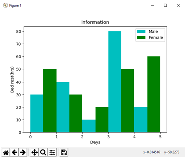
We have generated the bar graphs for the plots {(0.25,30), (1.25,40), (2.25,10), (3.25,80), (4.25,20)}and {(0.75,50), (1.75,30), (2.75,20), (3.75,50), (4.75,60)}.We have assigned cyan colour for the label male and green colour for the label female in the bar function. The x-axis is labelled using xlabel = Days and y-axis is labelled using ylabel = Bed rest(hrs). In this graph the comparison is made between male and female patients over a period of 5 days.
2. Histogram Using Matplotlib
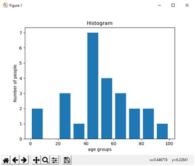
The histogram is used where the data is been distributed while bar graph is used in comparing the two entities. Histograms are preferred during the arrays or data containing the long list. Consider an example where we can plot the age of the population with respect to the bin. The bin refers to the range of values divided into a series of intervals. In the below example bins are created with an interval of 10 which contains the elements from 0 to 9, then 10 to 19 and so on.
Example code:
xxxxxxxxxx
import matplotlib.pyplot as plt
population_age = [22,55,62,45,21,22,34,42,42,4,2,102,95,85,55,110,120,70,65,55,111,115,80,75,65,54,44,43,42,48]
bins = [0,10,20,30,40,50,60,70,80,90,100]
plt.hist(population_age, bins, histtype=’bar’, rwidth=0.8)
plt.xlabel(‘age groups’)
plt.ylabel(‘Number of people’)
plt.title(‘Histogram’)
plt.show()
Result:
3. Scatter Plot Using Matplotlib
The scatter plots are preferred while comparing the data variables to determine the relationship between dependant and independent variables. The data is displayed as a collection of points, each having the value of one variable which determines the position on the horizontal axis and the value of other variable determines the position on the vertical axis. Below is an example of implementing two different scatter plots on a single graph.
Example code:
xxxxxxxxxx
import matplotlib.pyplot as plt
x1 = [1,1.5,2,2.5,3,3.5,3.6]
y1 = [7.5,8,8.5,9,9.5,10,10.5]
x2=[8,8.5,9,9.5,10,10.5,11]
y2=[3,3.5,3.7,4,4.5,5,5.2]
plt.scatter(x1,y1, label=’high bp low heartrate’,color=’r’)
plt.scatter(x2,y2,label=’low bp high heartrate’,color=’b’)
plt.title(‘Scatter Plot’)
plt.xlabel(‘x’)
plt.ylabel(‘y’)
plt.legend()
plt.show()
Result:
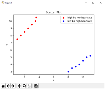
The above example has two scatter plots, the data is displayed as a collection of points having “high bp low heart rate” and “low bp high heart rate”. The scatter plot points of (x1,y1) are {(1,7),(1.5,8),(2,8.5),(2.5,9),(3,9.5),(3.5,10),(3.6,10.5)} and (x2,y2) are {(8,3),(8.5,3.5),(9,3.7),(9.5,4),(10,4.5),(10.5,5),(11,5.2)}.
4. Area Plot Using Matplotlib
The area plots were also called as stack plots. It is quite similar to the line plots. Area plots are used in tracking the changes over time for two or more related groups that make one whole category.
Example:
xxxxxxxxxx
import matplotlib.pyplot as plt
days = [1,2,3,4,5]
age =[72,82,61,11,27]
weight =[17,28,72,52,32]
plt.plot([],[],color=’c’, label=’age’, linewidth=5)
plt.plot([],[],color=’g’, label=’weight’, linewidth=5)
plt.stackplot(days,age,weight,colors=[‘c’,’g’])
plt.xlabel(‘x’)
plt.ylabel(‘y’)
plt.title(‘Area Plot’)
plt.legend()
plt.show()
Result:
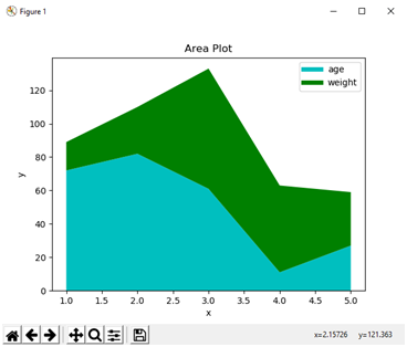
In the above example, we can see the time spent based on the categories of age and weight. Area plot or stack plot is used to show the trends over time among different attributes.
5. Pie Chart Using Matplotlib
A pie chart is a circular graph which is divided into segments or slices of pie. It is used to represent the percentage or proportional data where each slice of pie represents a category.
Example code:
xxxxxxxxxx
import matplotlib.pyplot as plt
slices = [12,25,50,36]
activities = [‘Prescription drugs’,’clinical services’,’hospital services’,’other services’]
cols = [‘c’,’m’,’r’,’g’]
plt.pie(slices,
labels=activities,
colors=cols,
startangle=90,
shadow= True,
explode=(0,0.1,0,0),
autopct=’%1.1f%%’)
plt.title(‘Pie Plot’)
plt.show()
Result:
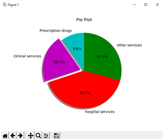
In the above example, we have divided the circle into 4 segments which represent the “Prescription drugs”, ”clinical services”, ” hospital services”, ”other services”. The slices list contains the values of the categories which automatically performs the percentage which they hold per each slice.
Opinions expressed by DZone contributors are their own.

Comments