Orange: A Handy Open-Source Tool for Creating Machine Learning Models
Orange is an extremely easy-to-use, lightweight, drag-and-drop tool for building machine learning models and analyzing data. More importantly, it is open source!
Join the DZone community and get the full member experience.
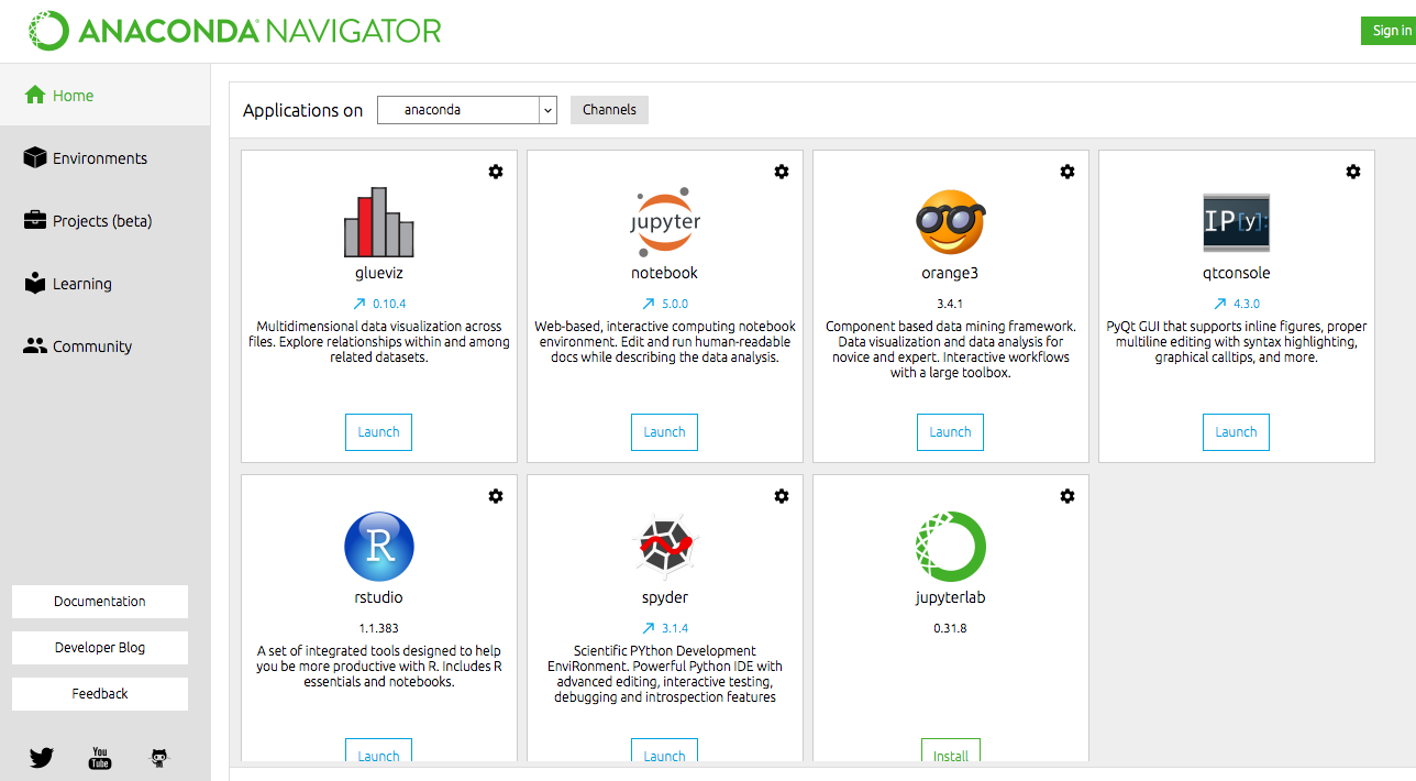
Join For FreeIn this tutorial, I will demonstrate Orange, a tool for machine learning. Orange is an extremely easy-to-use, lightweight, drag-and-drop tool. More importantly, it is open source! If you are an Anaconda user, then you can find it in the console as shown in the following image — a pure, fresh orange wearing sunglasses with a smile.
Introduction
Orange is a platform built for creating machine learning pipelines on a GUI workflow. People with no coding skills can operate Orange with ease. One can perform every task right from data preparation to model evaluation without writing a single line of code.
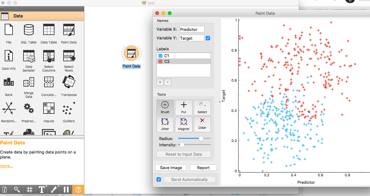
It also has many cool features that I didn't find in many other heavyweight tools. Have you ever painted data? You heard me right. You can paint data in Orange using its Paint Data functionality. It means you can create dummy data as per your requirements just by drawing the data points, and Orange will generate the data for you. This is a unique feature that is much needed for people who experiment a lot with data to come up with a prototype. We painted the data red and blue in Orange in the below figure.
Apart from this, it also has many differentiators like good visualization capabilities, an extensive list of models, and evaluation techniques. Let's peep at the tool by creating a machine model using the painted data we created earlier.
Orange has mainly four different tabs.
1. Data
It has around 26 different functions. One can extract data from different sources like files, SQL tables, and data tables. You can paint data, sample, merge, and select data. You can even construct features, detect outliers, and preprocess data. The list is long, and a plethora of data-related stuff is available at user's disposal.
2. Visualize
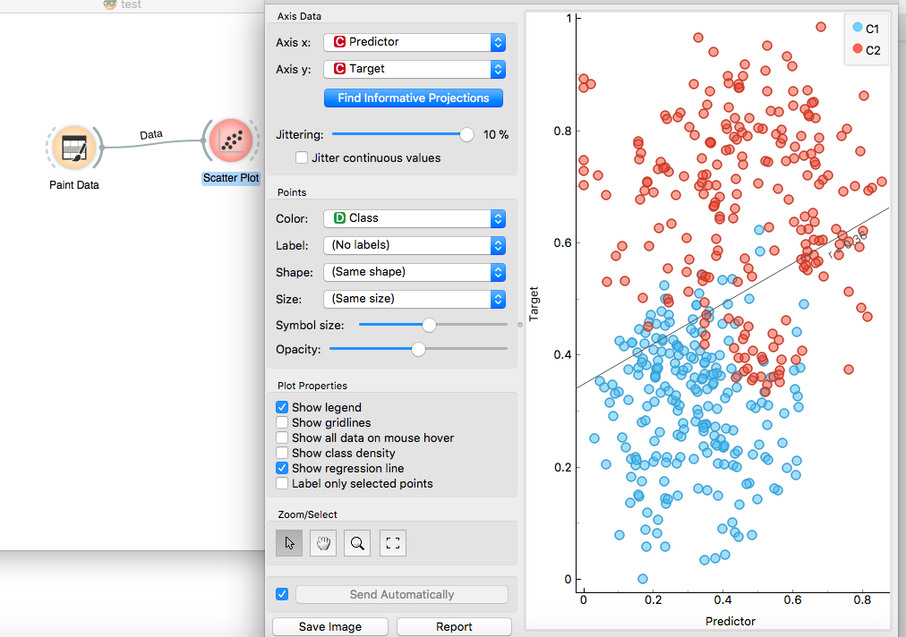
Around 15 different types of visualization are available, which can be used to view data across various dimensions. For our painted data, I created a quick scatter plot by connecting the Paint Data icon to the scatter plot diagram. In each of the visualizations, there is a handful of functions that can be used for creating marvelous plots. In our scatter plot shown below, I displayed a regression line using the Show Regression Line plot property. We can distinctly validate that, as there are two classes, c1 and c2, in our dataset, linear regression is not an appropriate technique.
3. Model
There are ten supervised ML modeling functions. Let's create a decision tree model for the dataset we created earlier.
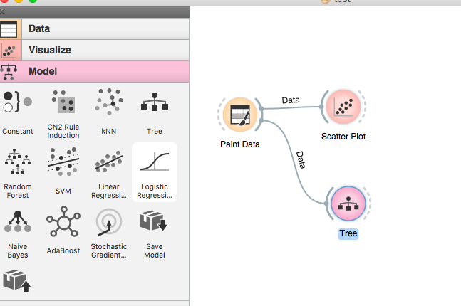
So, our classification model is now ready. How convenient was it? Super easy for me. Let's quickly visualize the tree model. We can select the Tree Viewer from the Visualization section to view the model as shown in below figure.
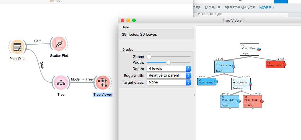
Now that our model is ready, let's move to the next section to evaluate the accuracy of the model.
4. Evaluate
The Test & Score node when connected to the Tree model and Test data node provides the scores of various evaluation metrics. For our painted data model, the AUC is 0.972 and F1 are 0.966, which confirms that it is a sound model.
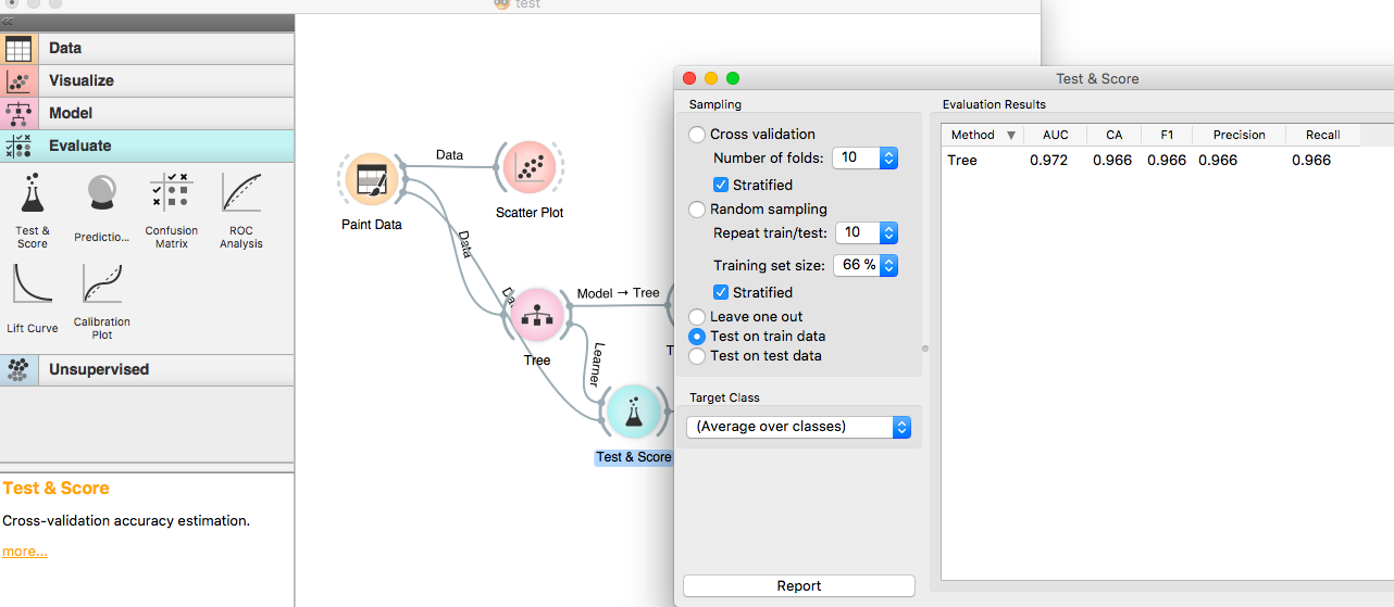
We can also view the confusion matrix by connecting the confusion matrix node to the Test & Score node.
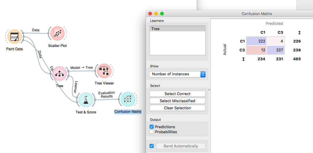
It was a matter of 30 minutes to create a model using Orange. Without any prior experience on using a tool, the same kind of demo model takes more than an hour to be built using other open-source tools.
We can save the model as a pickle file using the Save Model option from the Model tab.
That's it for now. Until next time, happy data mining using Orange!
The model can be downloaded from my GitHub.
Opinions expressed by DZone contributors are their own.

Comments