O11y Guide: Building an Advanced Dashboard
Get started using a basic template for a minimal dashboard from the previous lab and design components for your very first dashboard.
Join the DZone community and get the full member experience.
Join For FreeThe ongoing series covering my journey into the world of cloud-native observability continues in this article, where I'm continuing to explore an open-source dashboard and visualization project. If you missed any of the previous articles, head on back to the introduction for a quick update.
After laying out the groundwork for this series in the initial article, I spent some time in the second article sharing who the observability players are. I also discussed the teams that these players are on in this world of cloud-native o11y. For the third article, I looked at the ongoing discussion around monitoring pillars versus phases. In the fourth article, I talked about keeping your options open with open-source standards. In the fifth article in this series, I talked about bringing monolithic applications into the cloud-native o11y world. In my sixth article, I provided you with an introduction to a new open-source dashboard and visualization project and shared how to install the project on your local developer machine. In the seventh article, I explored the API and tooling provided by the Perses project. Then I spent time in the next article covering the open dashboard specification that you need to follow to start creating your first dashboard. Finally, in the previous article, you built your very first dashboard.
In this article, you'll flush out that first dashboard completing two rows of charts, gauges, and other components visualizing the performance of the target instance.
Being a developer from my early days in IT, it's been very interesting to explore the complexities of cloud-native o11y. Monitoring applications goes way beyond just writing and deploying code, especially in the cloud-native world. One thing remains the same: maintaining your organization's architecture always requires both a vigilant outlook and an understanding of available open standards.
This article is part of my ongoing effort to get practical hands-on experience in the cloud native o11y world. I'm going to get you started using a basic template for a minimal dashboard from the previous lab and start designing components for your very first dashboard. This is one lab in the more extensive free online workshop. Feel free to start from the very beginning of this workshop here if you missed anything previously:
Now let's dive into designing your first dashboard. Note this article is only a short summary, so please see the complete lab found online as lab 4.6 to work through creating an advanced dashboard yourself:
The following is a short overview of what is in this specific lab of the workshop.
Advancing the Dashboard
Each lab starts with a goal. In this case, it is fairly simple:
To build out your first basic dashboard, extend it with more components until you have an advanced dashboard with extensive metrics examples.
The lab kicks off with a view of what your server should be showing you after completing the previous lab. It's a dashboard with the first Memory Usage stat chart in the first role and nothing else. This lab jumps right in where you left off and you start adding a new Total Memory stat chart:
"statTotalMemory": {
  "kind": "Panel",
  "spec": {
    "display": {
      "name": "Total Memory",
      "description": "This is my second stat chart!"
    },
    "plugin": {
      "kind": "StatChart",
      "spec": {
        "query": {
          "kind": "TimeSeriesQuery",
          "spec": {
            "plugin": {
              "kind": "PrometheusTimeSeriesQuery",
              "spec": {
                "query": "node_memory_MemTotal_bytes{job='$job',instance=~'$instance'}"
              }
            }
          }
        },
        "calculation": "LastNumber",
        "unit": { "kind": "Percent" }
      }
    }
  }
}
Again, this is followed by an additional section added to the layouts section, which we will let the reader pursue in the lab online.
Note that in the workshop lab, you are given these code snippets as helpers; but I've also attempted to share proper testing and validation as you work towards a final dashboard using the provided CLI tooling:
$ ./bin/percli lint -f [PATH_TO_RESOURCE]/myfirstdashboard.json

your resources look good

$ ./bin/percli apply -f [PATH_TO_RESOURCE]/myfirstdashboard.json

object "Dashboard" "MyFirstDashboard" has been applied in the project "WorkshopProject"
Then verify that they were applied on your dashboard:
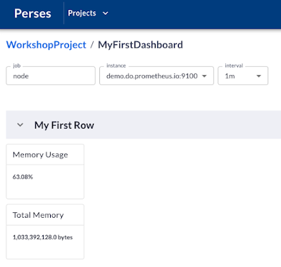
You can see that your memory usage and total memory components are placed in the first row of your dashboard and report on the current values for the server instance selected.
You then continue on and add two gauges, used to visualize the same two metrics as the stat charts. Once you complete those sections your first row of this dashboard is looking pretty solid:
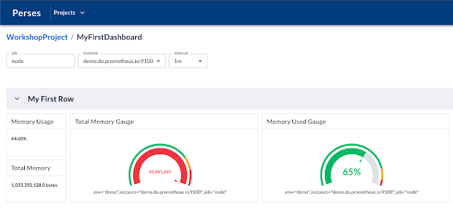
Next up, you create a new row and rename this first row while moving it to the second on your dashboard using the following adjustments to your layouts section:
"layouts": [
  {
    "kind": "Grid",
    "spec": {
      "display": { "title": "Line Chart Row", "collapse": { "open": true } },
      "items": []
    }
  },
  {
    "kind": "Grid",
    "spec": {
      "display": { "title": "Stat Chart Row", "collapse": { "open": true } },
      "items": []
    }
  }
]
Now you're ready to start adding some new metrics in line chart components:
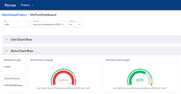
You add two new line chart components. The first is going to visualize memory totals from the target instance. The second visualizes the load on the instance and includes thresholds for indicating when values pass through the levels that require an alert. The reader is referred to the lab content to work through both of these line chart components and the final results should be as follows:
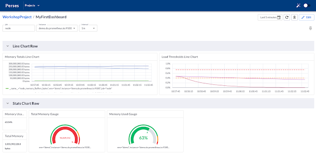
This is where you finish up the lab and are ready to move on to the final part of the workshop. It's all been a good learning experience, and if you sit back, you'll be a little surprised at how far you've come in a short amount of time.
Published at DZone with permission of Eric D. Schabell, DZone MVB. See the original article here.
Opinions expressed by DZone contributors are their own.

Comments