Orgchart With CSS Flex and ZK
We create a rather common application, an org chart, on the client-side using ZK to make working with HTML, CSS, and JS easier.
Join the DZone community and get the full member experience.
Join For FreeI invested a little time to "play" with CSS Flex to see if/how a simple organization chart can be styled using CSS Flex, mostly without CSS.
In order to create the hierarchy dynamically, I'll show how ZK Features can be leveraged - even though the example HTML/CSS are not ZK Framework specific and can be generated by any framework of your choice.
Flexible Orgchart Markup
The starting point is an ordinary, unordered html-lists (<ul>/<li>) as they conveniently allow nesting arbitrary hierarchies.
xxxxxxxxxx
<div xmlns="xhtml">
<ul>
<li>
Company
<ul>
<li>
Sales Department
<ul>
<li>Sales Unit I</li>
<li>Sales Unit II</li>
</ul>
</li>
<li>Purchase Department</li>
<li>
Controlling
<ul>
<li>Controlling Unit I</li>
</ul>
</li>
</ul>
</li>
</ul>
</div>
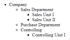
The browser will render something like the image below, already conveying the information needed - like in the good old '90s.
An orgchart is structurally the same: a Tree. We "just" need to align the items horizontally and connect the nodes somehow. There are definitely several libraries available using JavaScript/Canvas/SVG that will do the job.
The challenge here is: how far can we get with pure HTML/CSS for the layout - to ease markup generation with any templating engines or UI frameworks.
With the previous case, we can do this: (still coder's "art", nicer examples will follow)
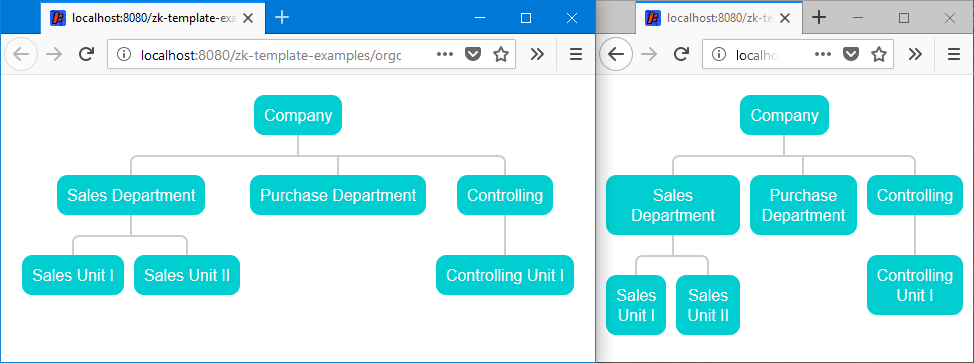
As you can see the nodes consume the available space. The text is allowed to line-break when necessary to avoid a horizontal scrollbar as long as possible. The connecting edges adjust without JS (using responsive CSS media queries we could adjust even further but that's a bit too much for this article).
Let's see how this is done:
In order to add the styles, orgchart-simple.zul makes some minor adjustments to the markup, besides adding the CSS stylesheets.
xxxxxxxxxx
<!--<?style src="css/debug.css"?>-->
<zk>
<div xmlns="xhtml" class="centered">
<ul class="orgchart">
<li class="root">
<div class="nodecontent">Company</div>
<ul>
<li>
<div class="nodecontent">Sales Department</div>
<ul>
<li class="leaf">
<div class="nodecontent">Sales Unit I</div>
</li>
<li class="leaf">
<div class="nodecontent">Sales Unit II</div>
</li>
...
(Don't be distracted by ZK's syntax to add stylesheets and the XHTML namespace declaration - the HTML/CSS is what's relevant right now).
The main differences (besides the added stylesheets) are the CSS classes for the root and leaf nodes, and the divs with class nodecontent.
simple.css just defines the nodecontent classes - here a typical flat box with round corners.
orgchart.css is arranging the ul/li elements as a tree - taking into account any size the.nodecontent-divs might have.
The relevant CSS rules to arrange the nodes for the tree structure are:
xxxxxxxxxx
/*align children horizontally using CSS flex*/
.orgchart ul {
display: flex;
}
/*align nodecontent and children list vertically*/
.orgchart li {
display: flex;
flex-direction: column;
position: relative;
}
/*arrange the nodecontent centered above the children list*/
.orgchart .nodecontent {
align-self: center;
position: relative;
margin: 20px 5px;
}
After adding some debugging styles (debug.css) the layout nesting becomes visible.
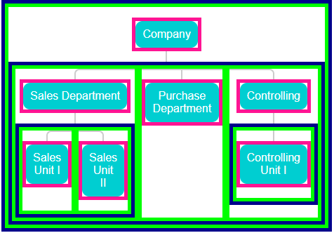
The ul elements are surrounded by a dark blue border (showing the horizontal arrangement).
The li elements are green highlighting their adaptive widths.
The pink borders surround the .nodecontent-divs which are centered horizontally while line breaks increase the height if needed.
Furthermore, the boxes also expose how the connectors work. Relative to the size of containing li-elements, the connecting lines are mostly located at very basic positions (center, left or right) and have a fixed height covering the 20px margin of the .nodecontent-divs. Their width is either 100% or adaptive calc(50%+1px) (1px because of the border width of 2px). These relative widths allow an arbitrary combination of node sizes and a flexible number of children without JS calculations.
The connecting lines are rendered using partial borders of CSS pseudo elements ::before and ::after. Below an excerpt of orgchart.css with the rules for the vertical top and bottom connectors.
xxxxxxxxxx
.orgchart .nodecontent::after,
.orgchart .nodecontent::before {
box-sizing: border-box;
content: '';
position: absolute;
z-index: -1;
border: 0px solid #CCCCCC;
}
...
.orgchart .nodecontent::after,
.orgchart .nodecontent::before {
border-left-width: 2px;
width: 2px;
height: 20px;
left: calc(50% - 1px);
}
.orgchart .nodecontent::before {
top: -20px;
}
.orgchart .nodecontent::after {
bottom: -20px;
}
The full stylesheet (orgchart.css) contains additional rules to hide connectors for root and leaf nodes, as well as the curved connectors (using border-radius) for the :first-child and :last-child li-elements.
xxxxxxxxxx
.orgchart li:first-child::before {
width: calc(50% + 1px);
right: 0;
border-left-width: 2px;
border-top-left-radius: 7px;
}
.orgchart li:last-child::before {
width: calc(50% + 1px);
border-right-width: 2px;
border-top-right-radius: 7px;
}
These styles are quite fine-tuned. They would definitely benefit from a CSS preprocessor such as LESS or SASS to replace recurring numbers such as the 20px height or the 2px line width. Also, they cause some sub-pixel misalignments at certain odd zoom levels (e.g. 190% varying between browsers) - however the picture never gets destroyed by zooming in/out and the connections remain stable.
Scaling Up a Bit
Obviously, the previous example was only suitable to demonstrate the basics and you'd rarely need an orgchart for such a trivial company hierarchy anyway. So how about this instead:
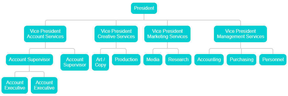
(source Wikipedia)
Using the same styles as above you can see the limitations quite clearly: it may be suitable for ultra-wide screens but it doesn't really take advantage of the screen height - and with orgcharts we often have those vertical structures in mind anyway - e.g. team members below a supervisor.
In addition, to save space, it would be nice to have something like this (a fully squeezed version of orgchart-vertical.zul)
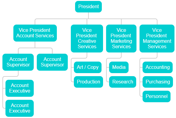
Now the same information is represented in a more compact way. The only difference is an additional optional stylesheet (orgchart-vertical.css) which contains slightly more complicated rules for the connectors of vertical nodes.
The HTML simply requires a CSS class to apply to the vertical layout for a specific node and children list.
xxxxxxxxxx
<ul class="orgchart">
<li class="root">
<div class="nodecontent">President</div>
<ul>
<li class="node">
<div class="nodecontent">Vice President <br/> Account Services</div>
<ul>
<li class="vertical">
<div class="nodecontent">Account Supervisor</div>
<ul>
<li class="leaf">
<div class="nodecontent">Account Executive</div>
</li>
<li class="leaf">
<div class="nodecontent">Account Executive</div>
</li>
</ul>
</li>
...
In line 8, the class="vertical" is the only thing that needs to be added in order to arrange the children of this node vertically. The same style class is added for the remaining 3 supervisor nodes in this chart.
The current styles only address leaf nodes below a vertical node - any further nesting will break the layout. I am sure this would be technically possible - for the sake of brevity and readability I stopped there.
Dynamic Rendering
This section is about rendering the chart using a Java object model and ZK's shadow elements with templates. Similar solutions will exist for other templating engines as long as they generate the same markup. If you're just interested in the final colorful result skip to the end and just inspect the generated HTML in the browser.
Model/Template-Based Rendering
The model consists of OrgNode and OrgNodeData objects. The former contains the children collection, the isLeaf and isVertical properties as well as a generic the data object.
xxxxxxxxxx
public class OrgNode<T> {
private T data;
private List<OrgNode<T>> children;
/*constructors omitted*/
public boolean isLeaf() { ... }
public boolean isVertical() { ... }
public T getData() { return data; }
public List<OrgNode<T>> getChildren() { return children; }
}
The latter (OrgNodeData) holds the actual information to render as the node content: title, name, icon, type (used for node-specific styling).
xxxxxxxxxx
public class OrgNodeData {
public enum Type {PRESIDENT, VICE_PRESIDENT, SUPERVISOR, EMPLOYEE}
private Type type;
private String title;
private String name;
private String icon;
...
Using this simple structure we can represent the organization hierarchy:
xxxxxxxxxx
public class OrgChartViewModel {
private static final String NO_IMAGE = null;
private OrgNode<OrgNodeData> orgChartRoot;
public void init() {
orgChartRoot = createOrgNode(PRESIDENT, "President", null, "icon/icon1.svg",
createOrgNode(VICE_PRESIDENT, "Vice President", "Account Services", "icon/icon2.svg",
createOrgNode(SUPERVISOR, "Account Supervisor", null, NO_IMAGE,
createOrgNode(EMPLOYEE, "Account Executive", null, NO_IMAGE),
createOrgNode(EMPLOYEE, "Account Executive", null, NO_IMAGE)
),
createOrgNode(SUPERVISOR, "Account Supervisor", null, NO_IMAGE)
),
createOrgNode(VICE_PRESIDENT, "Vice President", "Creative Services", "icon/icon3.svg",
...
}
public OrgNode<OrgNodeData> getOrgChartRoot() { return orgChartRoot; }
public static OrgNode<OrgNodeData> createOrgNode(
OrgNodeData.Type type, String title, String name, String icon,
OrgNode<OrgNodeData>... children) { ... }
}
The helper function createOrgNode(...) simplifies composing in the whole hierarchy in a single statement. No one is stopping you from building the hierarchy in a different way. All we then need is to expose the root node via getOrgChartRoot() and let UI templates consume the hierarchy recursively.
xxxxxxxxxx
<x:ul class="orgchart" xmlns:x="xhtml">
<apply template="node" node="${root}" root="${true}"/>
<template name="node">
<x:li class="${root ? ' root' : ''}${node.leaf ? ' leaf' : ''}${node.vertical ? ' vertical' : ''}">
<x:div class="nodecontent">
<if test="${collapsible}">
<apply template="collapsible" node="${node}"/>
</if>
<apply template="nodecontent" data="${node.data}"/>
</x:div>
<if test="${not empty node.children}">
<x:ul>
<forEach items="${node.children}">
<apply template="node" node="${each}" root="${false}"/>
</forEach>
</x:ul>
</if>
</x:li>
</template>
</x:ul>
This template is ZK specific and uses several features like shadow/xhtml elements and EL expressions to add contextual CSS classes: root, leaf, vertical (the collapsible part is explained in the next paragraph).
You'll find all previous elements (ul/li/div.nodecontent) controlled by ZK's shadow elements (if/forEach/apply). The recursion happens in line 14 only if the current node has children. This "node" template only cares about laying out the hierarchy and doesn't contain any nodecontent specific information making it reusable for user-defined nodecontent markup - also no property of the OrgNodeData object is accessed allowing a different class representing the node content.
In orgchart-model.zul, the nodecontent-template is defined and injected into <orgchart>.
xxxxxxxxxx
<!--<?style src="css/debug.css"?>-->
<zk>
<div sclass="centered"
viewModel="@id('vm') @init('zk.example.template.orgchart.OrgChartViewModel')">
<orgchart root="@init(vm.orgChartRoot)">
<template name="nodecontent">
<div>
<label value="${data.title}"/>
<if test="${!empty data.name}">
<separator/>
<label value="${data.name}"/>
</if>
</div>
</template>
</orgchart>
</div>
</zk>
Line 9 calls the orgchart-template, providing the markup (to be rendered inside the .nodecontent-div) and the root note root="@init(vm.orgChartRoot)" from the viewModel.
For different node styling, a different template can be provided as can be seen in orgchart-full.zul.
xxxxxxxxxx
<orgchart root="@init(vm.orgChartRoot)" collapsible="true">
<template name="nodecontent">
<div sclass="orgnode ${data.type}">
<if test="${!empty data.icon}">
<div sclass="icon" style="${('background-image: url(\'' += data.icon += '\')')}"/>
</if>
<label value="${data.title}"/>
<if test="${!empty data.name}">
<separator/>
<label value="${data.name}"/>
</if>
</div>
</template>
...
</orgchart>
Above, the node type is used as a styleclass for individual node styles, and, if present, an icon is prepended as well.
Collapsible Nodes
A simple way to collapse and expand nodes is by just hiding/showing the children using JS (finally some JavaScript).
orgchart-model-collapsible.zul
xxxxxxxxxx
<zk xmlns:w="client">
<script>
function toggleNode(wgt) {
jq(wgt).closest('li').toggleClass('collapsed');
jq(wgt).find('i').toggleClass('z-icon-minus z-icon-plus');
}
</script>
<div sclass="centered" viewModel="@id('vm') @init('zk.example.template.orgchart.OrgChartViewModel')">
<orgchart root="@init(vm.orgChartRoot)" collapsible="true">
<template name="nodecontent">...</template>
<template name="collapsible">
<if test="${not node.leaf}">
<a sclass="collapse" iconSclass="z-icon-minus" w:onClick="toggleNode(this);"/>
</if>
</template>
</orgchart>
</div>
</zk>
Setting the flag collapsible="true" on <orgchart> (Line 9) will invoke the collapsible-template for each node. In Line 13, I specified to only render the collapse toggle for non-leaf nodes.
All it renders is an <a>-element with a client-side listener w:onClick, which calls a trivial JS function to toggle style classes (jq is ZK's alias for jQuery's $-function). The styles for the collapse icon are defined in both simple.css or full.css to allow custom styling/positioning of the toggle in case this is needed.
xxxxxxxxxx
.nodecontent .collapse {
position: absolute;
bottom: -15px;
left: calc(50% - 6px);
z-index: 0;
color: white;
background-color: #CCCCCC;
border-radius: 6px;
height: 12px;
width: 12px;
font-size: 12px;
text-align: center;
}
Also, here, the positioning is adaptive to the actual nodecontent dimensions: centered below the nodecontent.
If we wanted we could control the open/close state in the OrgNode object and bind a server-side command-handler to load additional nodes on demand (here I didn't, but good to know we have the option).
Fully Styled Example
Sometimes you're lucky and you get some nice design templates from a dedicated designer (unfortunately this is an often forgotten role).
By styling (see: full.css) just the inner .orgnode-divs we get the below screenshot, which makes a big difference in appearance, even though the overal implementation remains the same:
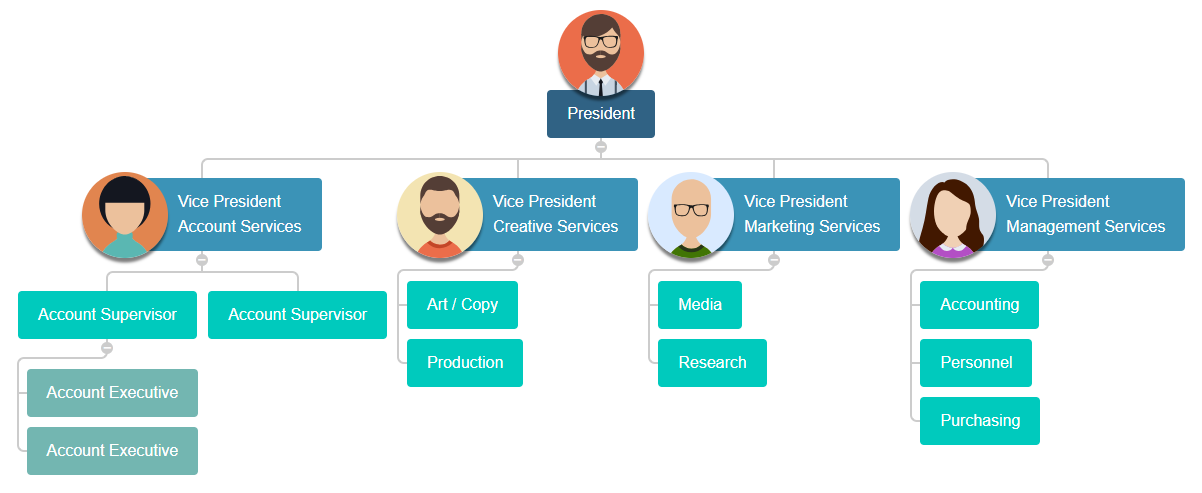
Our previous efforts - ensuring the connections are independent of the actual node size - support these irregular shapes. Keep in mind that the nodes are still just treated like ordinary rectangular divs (again notice the automatic line breaks fitting into the available space where possible).

Wrapping Up
I hope this article was insightful for you. For me, it was definitely an enjoyable little distraction to explore the possibilities of a (finally) widely adopted CSS feature.
Example and Source
The source code (among other templating examples) is available on github/zkoss-demo/zk-template-examples project and contains instructions on how to run the project from command line.
Once the example project is running you can access the example pages for this article below:
http://localhost:8080/zk-template-examples/orgchart/
e.g.: http://localhost:8080/zk-template-examples/orgchart/orgchart-full.zul
Browser Compatibility
Obviously, the example uses CSS flexbox so it should support all modern browsers. On IE11 I noticed that the automatic line breaks don't happen automatically so that a horizontal scrollbar is added earlier - still, the whole chart is accessible. If anyone knows how that can be enabled for IE11 too, I'd be happy for a helpful comment.
Opinions expressed by DZone contributors are their own.

Comments