A Custom Element is simply a JavaScript ES6 class that sublcasses HTMLEmlement (the base class used by all of the native HTML elements). After the class has been defined, the element must be registered by calling customElements.define(). (If you need to support browsers like IE11 that don’t support ES6 classes, you will need to transpile to ES5 using a transpiler such as Babel and also include custom-elements-es5-adapter from webcomponents.js.)
Once it has been registered with the document with customElements.define(), you can then start using it in your page (assuming you have loaded the webcomponents.js polyfill and the JavaScript for the custom element itself).
Element Upgrades
The browser progressively enhances custom elements by default. When the element is initilaly parsed, it is a plain HTMLElement until customElements.define() is called (this process is called “element upgrades”). This means that users can work with the element before it is upgraded; keep this in mind when writing your elements. You can check to see if an element has been upgraded by calling customElements.whenDefined(), which returns a Promise:
customElements.whenDefined('vt-counter').then(() => {
  console.log('vt-counter defined');
});
Lifecycle Callbacks
Custom Elements can optionally implement several callbacks that get executed during their lifecycle.
constructor() |
Called when the element is upgraded or created using document.createElement() or using the new keyword. Useful for initializing the Shadow DOM and performing any other initialization work that doesn’t involve attributes or “light DOM” children (child elements which are not part of the Shadow DOM). |
connectedCallback() |
Called when the element has been added to the DOM. Useful for initializing properties/attributes, fetching resources, light DOM children, etc. Most of the setup work should be performed here. |
attributeChangedCallback(attrName, oldVal, newVal) |
Called whenever an attribute value has been added, removed, or changed. Also called for the initial attribute values when the element is upgraded. Useful for handling any behaviorial side-effects of changes to attribute values. Note this is only called for attributes defined using the observedAttributes() static property (otherwise you would get a call everytime someone updated default attributes, like class or id). |
disconnectedCallback() |
Called when the element is removed from the DOM (someone called remove() on the element); useful for cleanup (such as removing event listeners). Note that this callback won’t always be called (for example if someone closes the tab). |
adoptedCallback() |
Called when an element is moved to another document. This happens when someone calls document.adoptNode(). This is not supported by the webcomponents.js polyfill. |
Note that these callbacks are synchronous, so make sure they are fast.
Properties vs Attributes
All HTML elements have an array of attributes which are strings. For example, given the element my-widget below:
<my-widget id="myWidget" type="round" weight="45"></my-widget>
The attributes are id, type, and weight. They can be set programmatically like so:
    const widget = document.getElementById('myWidget');
    widget.setAttribute('type', 'square');
However, we often want to use actual properties, which allow us to use a getter and setter, as well as a nicer programmatic interface:
widget.type = 'square';
In this case, we need to synchronize the property and attribute values. When the act of updating a property also updates the corresponding attribute, this is considered “reflecting to the attribute”. Only do this for primitive types; if the property is an Object or Array, you’re better off storing it as a normal property on your custom element (serializing large objects to the DOM as an attribute is expensive).
Examples
Here’s an example of a custom element that counts up from first, or 0 if first is not defined. The user can start and stop the timer by clicking on it. Let’s start with the first few methods:
class VirtuaTrainingCounter extends HTMLElement {
    static get observedAttributes() {
        return ['value', 'interval'];
    }
    // Store properties as attributes so they work both ways.
    get interval() {
        const attr = this.getAttribute('interval');
        return attr ? Number(attr) : 2000;
    }
    set interval(interval) {
        this.setAttribute('interval', interval);
        this.stop();
        this.start();
    }
    // Don't store this property as an attribute because it changes frequently.
    get value() {
        if (!this._value) {
            this._value = 0;
        }
        return this._value;
    }
    set value(value) {
        const num = Number(value);
        this._value = num;
        if (this._content) {
            this._content.innerText = num;
        }
    }
    constructor() {
        super();
        console.log('inside constructor');
        this._onClick = this._onClick.bind(this);
    }
    /** Fires after an instance has been inserted into the document */
    connectedCallback() {
        console.log('inside connectedCallback');
        this._content = document.createElement('span');
        this._content.innerText = 'Counter';
        this._content.className = 'counter-disabled';
        this.appendChild(this._content);
        this._upgradeProperty('value');
        this._upgradeProperty('interval');
        this.addEventListener('click', this._onClick);
    }
...
// Registers <vt-counter> as a custom element
window.customElements.define('vt-counter', VirtuaTrainingCounter);
So far, there isn’t much going on here. The static observedAttributes property tells the browser to only call attributeChangedCallback() when these attributes are set.
In connectedCallback(), we setup the light DOM of the component, register the event handler for click events, and initialize the properties. The call to upgradeProperty() is of particular interest. Using a method like this isn’t a requirement, but it helps to ensure that your custom element works in frameworks (such as Angular) that may set the property before the component is upgraded. In this case, the property would not have gone through the setter, so we need to perform a little trickery: delete the property and then re-add it (which ensures that the setter is called):
    _upgradeProperty(prop) {
        if (this.hasOwnProperty(prop)) {
            let value = this[prop];
            delete this[prop];
            this[prop] = value;
        }
    }
The connectedCallback() method also registers the _onClick() method, which starts or stops the timer when the user clicks on it.
_onClick() {
if (!this._timer) {
this.start();
}
else{
this.stop();
}
}
The start() and stop() methods perform the real work of the component:
start() {
    this._content.classList.remove('counter-disabled');
    this._content.innerText = this.value;
    this._timer = setInterval(() => {
        this.value++;
    }, this.interval);
    this.dispatchEvent(new CustomEvent('vt-counter-started', {
        detail: {
            value: this.value,
        },
        bubbles: true,
        cancelable: true,
        composed: true
    }));
}
stop() {
    if (this._timer) {
        clearInterval(this._timer);
        this._timer = null;
        this._content.classList.add('counter-disabled');
        this.dispatchEvent(new CustomEvent('vt-counter-stopped', {
            detail: {
                value: this.value
            },
            bubbles: true,
            cancelable: true,
            composed: true
        }));
    }
}
In the start() method, we remove the counter-disabled class so it’s clear the timer is running and use JavaScript’s setTimeout() function to increment the value property every interval milliseconds. We also fire a custom event to let users know the timer has started. (The composed value is important; it ensures the event will bubble out of the shadow DOM if the counter is used inside of a shadow root). You may have noticed the name of the custom event has a prefix of “vt-counter”. This helps avoid confusion that can occur if multiple components emit an event with the same name.
In the stop() method, we add the ‘counter-disabled’ class, so it’s clear the timer has stopped, and remove the timer. This time, we fire a different custom event to inform users that the timer has stopped.
When someone sets value attribute, we want to update the value property. This will allow us to set the initial value declaratively in HTML, but will not update the attribute in the DOM every time the property changes. We can achieve this by using the attributeChangedCallback():
/**
 * Fires after an attribute has been added, removed, or updated. Updates `value` property if the `value` attribute
 * is updated.
 */
attributeChangedCallback(attr, oldVal, newVal) {
    console.log('inside attributeChangedCallback', 'attr:', attr, 'oldVal:', oldVal, 'newVal:', newVal);
    if (attr === 'value') {
        this.value = newVal;
    }
}
Finally, we need to do some cleanup work in the disconnectedCallback():
/**
 * Fires after an instance has been removed from the document. Here
 * we stop the timer and remove event listeners.
 */
disconnectedCallback() {
    console.log('inside disconnectedCallback');
    this.stop();
    this.removeEventListener('click', this._onClick);
};
Here we stop the timer and remove the event listener.
Once you’ve written a custom element, you can include it just like any other JavaScript code, and then use it inside of your HTML page:
<!DOCTYPE html>
<html>
<head>
    <meta charset="UTF-8">
    <title>Counter Web Component Demo</title>

    <!-- Importing Web Component's Polyfill -->
    <script src="bower_components/webcomponentsjs/webcomponents-loader.js"></script>

    <!-- Import our custom element -->
    <script src="vt-counter.js"></script>

    <style>
        body {
            text-align: center;
        }

        .counter {
            color: indigo;
            font-size: 60pt;
            font-family: sans-serif;
            text-align: center;
            padding: 10px;
            border: 1px black inset;
        }

        .counter:hover {
            cursor: pointer;
        }

        .counter-disabled {
            color: gray;
        }
    </style>
</head>
<body>
    <h1>Counter Web Component Demo</h1>
    <!-- Using our new custom element -->
    <vt-counter class="counter" value="10"></vt-counter>
</body>
</html>
Here we load the webcomponents.js polyfill and our custom element’s source, which allows us to easily use it in the page. We can even style it. Here is a screenshot of the counter after the user has clicked on it:

View a demo live on Plunker.
Here are a few rules to keep in mind when developing custom elements:
- The name must contain a dash (-) so the browser can distinguish between the custom element and regular elements. For example,
<foo-bar> and <acme-tabs> are valid names, but <foobar> and <acme_tabs> are not. Most components use a prefix for the project of which they are part, in order to avoid namespace collisions. For example, instead of having a <basic-tabs> component, you might have a <acme-basic-tabs> component if your project was called Acme.
- The same name cannot be registered more than once (you will get a DOMException if this happens).
- Custom elements cannot be self-closing; you must always use a closing tag (e.g.
<my-custom-element></my-custom-element>).
Extending Custom Elements
You can extend custom elements just like any other class (see the following sections for examples). Although the spec mentions subclassing native elements (like <input> or <div>), Apple does not approve of this feature, and no browser currently supports it (see the status). There is currently a discussion about an alternative solution on GitHub.
Using HTML Templates
One of the problems with the Custom Element example in the previous section is that the styles are not self-contained; they must be declared in the document that uses the component. Also, the DOM is built imperatively. Both of these issues can be solved by using HTML templates. Here is a subclass of the VirtuaTrainingCounter component that uses HTML templates:
(function() {

    /**
     * Declare the template here so it can be re-used by multiple instances of the element.
     * Cloning from the template instead of using innerHTML is more performant since the markup
     * is only parsed once.
     */
    const template = document.createElement('template');
    template.innerHTML = `

        <style>
            .counter {
                color: indigo;
                font-size: 60pt;
                font-family: sans-serif;
                text-align: center;
                padding: 10px;
                border: 1px black inset;
            }

            .counter-disabled {
                color: gray;
            }
        </style>

        <span id="value" class="counter counter-disabled">Counter</span>
        `;

    class VirtuaTrainingHtmlTemplateCounter extends VirtuaTrainingCounter {

        /**
         * Fires when an instance was inserted into the document.
         * @override
         */
        connectedCallback() {
            console.log('inside overridden connectedCallback')
            const templateContent = template.content.cloneNode(true);
            this._content = templateContent.getElementById('value');
            this.appendChild(templateContent);

            this._upgradeProperty('value');
this._upgradeProperty('interval');
this.addEventListener('click', this._onClick);
        }
    }


    // Registers <vt-html-template-counter> as a custom element
    window.customElements.define('vt-html-template-counter', VirtuaTrainingHtmlTemplateCounter);
})();
The first difference here is that we include the code inside of an immediately-invoked function expression (IIFE) so that we can declare the template element in a private scope (you could use a module to achieve a similar effect). This allows us to create and initialize the template so that it can be cloned by multiple instances of the component. HTML Templates can also be defined in pure HTML using the <template> element, but this approach ensures the component will work in a larger variety of environments.
Inside of the connectedCallback() (which overrides the version defined in the superclass), we simply clone the template rather than building the DOM programmatically.
The HTML for the page that uses the component is pretty much the same as the previous example, except that we must include the code for the superclass, and there is no need to declare styles for the element:
<!DOCTYPE html>
<html>
<head>
    <meta charset="UTF-8">
    <title>Counter HTML Template Web Component Demo</title>

    <!-- Importing Web Component's Polyfill -->
    <script src="bower_components/webcomponentsjs/webcomponents-loader.js"></script>

    <!-- Import our custom element -->
    <script src="vt-counter.js"></script>
    <script src="vt-counter-html-template.js"></script>

    <style>
        body {
            text-align: center;
        }
    </style>
</head>
<body>
    <h1>Counter HTML Template Web Component Demo</h1>
    <!-- Using our new custom element -->
    <vt-html-template-counter value="10"></vt-html-template-counter>
</body>
</html>
View a demo live on Plunker.
Using Shadow DOM
Even though the styles defined in the previous example are declared inside of the component itself, they’re not truly encapsulated. Any other element on the page can use the CSS classes .counter and .counter-disabled. Moreover, the id of the <span> element isn’t namespaced, so it will collide with any other element on the document with the id value. Both of these issues can be solved with Shadow DOM. All we have to do is create a shadow root for the component and append the cloned template to it. In the following example, VirtuaTrainingShadowDomCounter subclasses VirtuaTrainingCoounter to do just that:
(function() {

    /**
     Declare the template here so it can be re-used by multiple instances of the element.
     Cloning from the template instead of using innerHTML is more performant since the markup
     is only parsed once.
     */
    const template = document.createElement('template');
    template.innerHTML = `
        <style>
            :host {
                border: 1px black inset;
                padding: 10px;
                display: inline-block;
            }
            .counter {
                color: indigo;
                font-size: 60pt;
                font-family: sans-serif;
                text-align: center;
            }
            .counter:hover {
                cursor: pointer;
            }
            .counter-disabled {
                color: gray;
            }
        </style>

        <slot></slot>
        <span id="value" class="counter counter-disabled"></span>
        `;

    class VirtuaTrainingShadowDomCounter extends VirtuaTrainingCounter {

        /**
         * @override
         */
        constructor() {
            super();

            console.log('inside overridden constructor');
            const templateContent = template.content.cloneNode(true);
            this._content = templateContent.getElementById('value');
            this.attachShadow({mode: 'open'});
            this.shadowRoot.appendChild(templateContent);

        }

        /**
         * Fires when an instance was inserted into the document.
         * @override
         */
        connectedCallback() {
            console.log('inside overridden connectedCallback');
            this._upgradeProperty('value');
this._upgradeProperty('interval');
this.addEventListener('click', this._onClick);
        }
    }

    // Registers <vt-shadow-dom-counter> as a custom element
    window.customElements.define('vt-shadow-dom-counter', VirtuaTrainingShadowDomCounter);
})();
Here, we use an HTML template wrapped in an IIFE as in the previous example, but this time we create a shadow root in the constructor and append the clone of the template there. In the previous example, DOM manipulation was performed in connectedCallback() because the Custom Elements specification disallows creating children in the constructor. The constructor is, however, a fine place to create the shadow root and add children to it. connectedCallback() has been overridden simply to avoid building a light DOM, as the superclass does.
There are a couple of important differences in the template. First, there is the :host CSS pseudo-class; this allows us to style the host of the shadow root, which is the custom element itself. In the markup portion of the template, there is also a new <slot> element. This will insert the content specified inside of the custom element by the calling document.
Usage of this component is the same as the previous example, except we can now include additional content to be displayed inside of the counter:
<!DOCTYPE html>
<html>
<head>
    <meta charset="UTF-8">
    <title>Counter Shadow DOM Web Component Demo</title>

    <!-- Importing Web Component's Polyfill -->
    <script src="bower_components/webcomponentsjs/webcomponents-loader.js"></script>

    <!-- Import our custom element -->
    <script src="vt-counter.js"></script>
    <script src="vt-counter-shadow-dom.js"></script>

    <style>
        body {
            text-align: center;
        }

        .header {
            font-size: 14pt;
            color: black;
        }
    </style>
</head>
<body>
    <h1>Counter Shadow DOM Web Component Demo</h1>

    <vt-counter-shadow-dom first="10">
        <div class="header">Shadow DOM Counter</div>
    </vt-counter-shadow-dom>
</body>
</html>
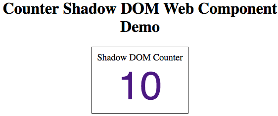
The output looks like this:

Thanks to the <slot> element, the text “Shadow DOM Counter” is displayed within the vt-counter-shadow-dom custom element. (You can even provide named slots, which can be inserted in different parts of the Shadow DOM.) Moreover, the header style class from the including document is applied to the text, while styles declared within the element itself are not visible outside of the element. Child elements are not visible either, which means the <span> element with the id “value” is no longer in danger of having conflicts. In other words, Shadow DOM gives us full encapsulation of the internal structure of our custom element, but still allows the calling document to insert content into the custom element.
View a demo live on Plunker.
Note that Shadow DOM works equally well without HTML Templates; you reap all the same benefits whether you build the DOM from a template, imperatively, or both.


{{ parent.title || parent.header.title}}
{{ parent.tldr }}
{{ parent.linkDescription }}
{{ parent.urlSource.name }}