Variable Fonts vs. Static Fonts and Cross-Browser Compatibility, Part Two
Get some clarity for font-use across browsers.
Join the DZone community and get the full member experience.
Join For Free
Welcome back! If you missed Part One, you can check it out here.
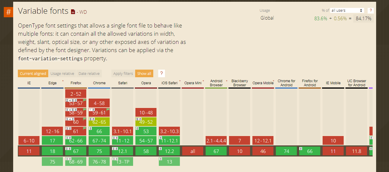
As of June 2019, variable fonts are supported by 84.17% of user browsers worldwide. The current versions of all major browsers provide full support for this feature with the only exception being the much-dreaded Internet Explorer, which is notorious for its poor browser support.
Among desktop and mobile browsers that provide support for variable fonts are Microsoft edge 17+, Google Chrome 66+, Firefox 62+, Safari 11+, Opera 53+ and Chrome 74, Firefox 66, iOS Safari 11+, and Android browser 67 respectively.
There are no polyfills or other fixes to provide cross-browser compatibility for variable fonts. If your website visitors are still using IE or older browser versions, then variable fonts might not be your cup of tea. However, by using @supports CSS feature queries, you can provide fallbacks for unsupported browsers to ensure a uniform experience to a certain degree.
Incorporate Variable Fonts Using CSS @font-face Rule
To incorporate variable fonts in your stylesheet, use the CSS @font-face rule which allows you to load any custom fonts on a webpage. You must first define a name for the font followed by the source and font format followed by value range for each variation axis. For example:
@font-face {
  font-family: "amstelvar";
  src: url("/fonts/amstelvar.ttf")
  format("truetype-variations");

  /* Define value range for each variation axis */
  font-weight: 1 999;
  font-stretch: 0% 100%;
  font-optical-sizing: 0 100;
}
Note that standard static fonts have formats truetype or woff woff2. In order to distinguish between static fonts and variable fonts, set font format to either truetype-variations or woff2-variations. This will indicate to the browser that it is a variable font. The majority of variable fonts would have .ttf format. However, it is recommended to use .woff or .woff2 formats for better performance and smaller sizes. You can convert your fonts towoff2 using the popular Google command line tool here.
Below is an example code for incorporating a variable font named “Amstelvar.” You can alter the values of “wgth” weight, “wdth” width, and “opsz” optical sizing axis either by using axis CSS properties or by using font-variations settings.
@font-face {
   font-family: 'amstelvar';
   src: url('/Amstelvar-Roman-VF.ttf') format("truetype-variations");
   font-weight: 1 999;
   font-stretch: 0% 100%;
   font-optical-sizing: 0 100;
}
.heading-1 {
   font-size: 70px;
   font-family: 'amstelvar';
   /* Using CSS properties */
   font-weight: 850;
   font-stretch: 90%;
   font-optical-sizing: auto;
   /* Using font-variation-settings property */
   font-variation-settings: "wght"850, "wdth"90, "opsz"90;
}
.heading-2 {
   font-size: 50px;
   font-family: 'amstelvar';
   /* Using CSS properties */
   font-weight: 100;
   font-stretch: 20%;
   font-optical-sizing: auto;
   /* Using font-variation-settings property */
   font-variation-settings: "wght"100, "wdth"20, "opsz"30;
}
.heading-3 {
   font-size: 40px;
   font-family: 'amstelvar';
   /* Using CSS properties */
   font-weight: 500;
   font-stretch: 70%;
   font-optical-sizing: none;
   /* Using font-variation-settings property */
   font-variation-settings: "wght"500, "wdth"70, "opsz" 0;
}
Animating Variable Fonts
Variable fonts can be used to create creative font animations. There are two ways to achieve this task:
- CSS transition property.
- CSS @keyframes animation rule.
As stated earlier, I will demonstrate both of them below using LambdaTest, a cross-browser testing cloud, to show these animations of variable fonts over different browsers.
Animating Variable Fonts Using CSS Transition Property
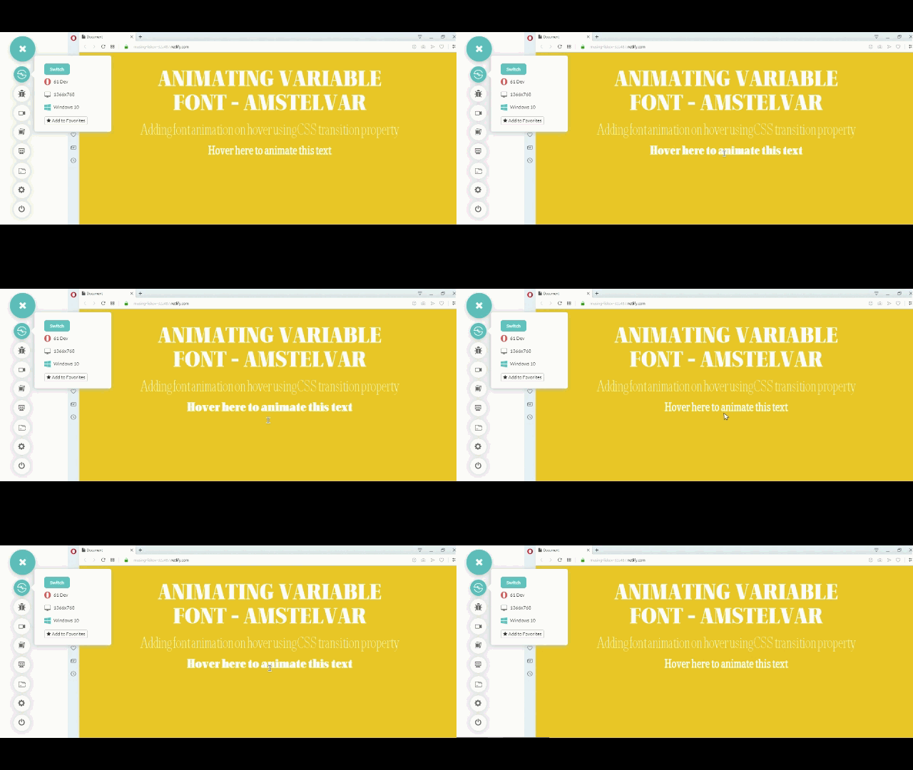
A CSS transition property can be used in cases when font animation is linked to an event like a mouse click or mouse hover. The code snippet below is an example of how to animate the variable font "Amstelvar" using a CSS transition property when the mouse cursor has hovered over it. When the text class heading-3 is hovered over, the wgth weight axis value is changed from 300 to 999; wdth width axis value is changed from 40% to 70% and opsz optical-sizing axis value is changed from 0 to 70.
@font-face {
   font-family: 'amstelvar';
   src: url('/Amstelvar-Roman-VF.ttf') format("truetype-variations");
   font-weight: 1 999;
   font-stretch: 0% 100%;
   font-optical-sizing: 0 100;
}
.heading-1 {
   font-size: 70px;
   font-family: 'amstelvar';
   font-variation-settings: "wght"850, "wdth"90, "opsz"90;
}
.heading-2 {
   font-size: 50px;
   font-family: 'amstelvar';
   font-variation-settings: "wght"100, "wdth"20, "opsz"30;
}

.heading-3 {
   font-size: 40px;
   font-family: 'amstelvar';
   font-variation-settings: "wght"300, "wdth"40, "opsz"0;
   transition: font-variation-settings 2s ease;
}
.heading-3:hover{
   font-variation-settings: "wght"999, "wdth"70, "opsz"70;
}
Now, let us perform cross-browser testing to evaluate the difference of rendering between Opera and IE 11. Note that variable fonts are supported in the desktop version of the Opera browser but not in Opera mini, which is meant for mobile.
First, we have a look at Opera Desktop version 61 Dev.
Now, we have a look at Internet Explorer 11.
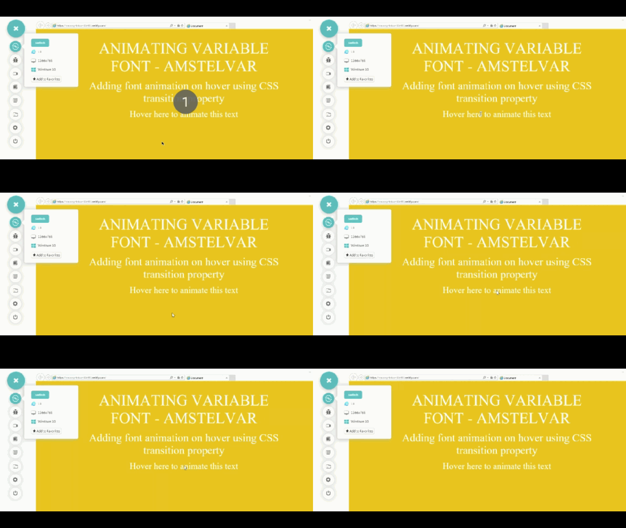
After performing cross-browser testing, we ensured that the CanIUse table represented above holds correctly with respect to variable fonts implementation across different browsers.
Animating Variable Fonts Using CSS @keyframes Rule
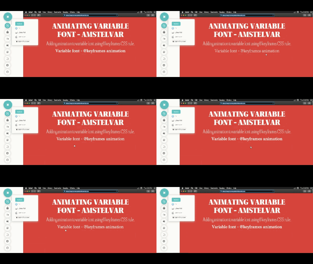
Apart from CSS transition properties, there is another way to animate Variable Fonts using the @keyframes animation rule. The code snippet below is an example of creating an infinite animation with an animation duration of three seconds, changing the wdth width axis value from 100 to 600.
@font-face {
   font-family: 'amstelvar';
   src: url('/Amstelvar-Roman-VF.ttf') format("truetype-variations");
   font-weight: 1 999;
   font-stretch: 0% 100%;
   font-optical-sizing: 0 100;
}
.heading {
   font-size: 40px;
   font-family: 'amstelvar';
   animation: myFont 3s ease infinite;
 }
@keyframes myFont{
   0%{
       font-variation-settings: "wght" 100;
   }
   100%{
       font-variation-settings: "wght" 500;
   }
}
Now, it's time to perform cross-browser testing and see how our code works across different browsers. In this example for variable fonts, we will compare IE 11 with Safari, running on Windows 10 and macOS Mojave respectively.
First, we have a look at Safari Desktop Mac mojave.
Now, we have a look at Internet Explorer 11.
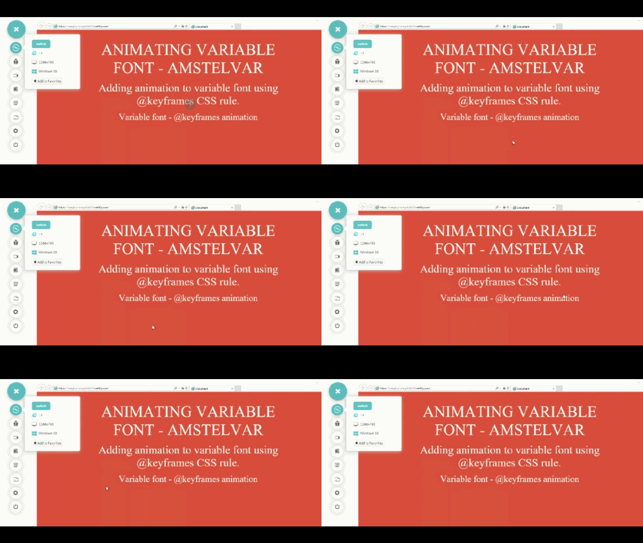
You may not be certain if variable fonts are the right call for your website. However, after performing cross browser testing for variable fonts, you are certain that they won’t be working for website visitors who are using IE 11 or below version.
So what can you do if font variables won’t work for you? If your a considerable amount of visitors on your website are coming through Internet Explorer, how can you present them with well designed font variations? Don’t worry, I have got a solution for you.
Fallbacks For Unsupported Browsers
The easiest way to provide fallback for variable fonts in unsupported legacy browsers like Internet Explorer or mobile browsers like opera mini and UC browser is to provide two file versions of the same font inside the @font-face Rule. The first version is the variable font file having a woff2-variations or truetype-variations format while the second file is the traditional static font file having a woff, woff2, or ttf format. Without providing a static font format, variable fonts will not render on any unsupported browser.
For example one of the most popular variable fonts, "IBM Plex," is available in both variable and static font formats. If you want to have fallback for IBMPlex with two font-styles having font-weights 400 and 700 in unsupported browsers, add the following code:
@font-face {
   font-family: 'IBMPlex';
   src: url('IBMPlex-variable.woff2') format('woff2-variations'),
       url('IBMPlex-regular.woff2') format('woff2');
   font-weight: 400;
}

@font-face {
   font-family: 'IBMPlex';
   src: url('IBMPlex-variable.woff2') format('woff2-variations'),
       url('IBMPlex-regular.woff2') format('woff2');
   font-weight: 700;
}
Browsers that provide support for variable fonts feature will download the woff2-variations or truetype-variations font format while those browsers that don’t support this feature will download the woff, woff2, or ttf formats, as specified inside the @font-face rule.
To make sure that browsers download the correct font format, as intended based on their feature support, make use of @supports CSS feature queries, as shown below –
.heading {
   font-family: 'IBMPlex'sans-serif;
   font-weight: 700;
}

@supports (font-variation-settings: normal) {
   .heading {
       font-family: 'IBMPlex', sans-serif;
       font-variation-settings: "wght"850, "wdth"90, "opsz"90;
   }
}
Here is another example using the variable font "Source Sans" by Adobe. Here, when testing, I am going to view my webpage with variable font on modern browsers, such as Chrome, and test for the fallback static font on an unsupported browser, such as Internet Explorer 11.
@font-face {
   font-family: 'SourceSans';
   src: url('SourceSansVariable-Roman.ttf') format('truetype-variations'),
       url('SourceSansPro-Regular.ttf') format('truetype');
   font-weight: 400;
}
@font-face {
   font-family: 'SourceSans';
   src: url('SourceSansVariable-Roman.ttf') format('truetype-variations'),
       url('SourceSansPro-Bold.ttf') format('truetype');
   font-weight: 700;
}

.heading-1 {
   font-size: 70px;
   font-family: 'SourceSans';
   font-weight: 700; /* For IE */
}

.heading-2 {
   font-size: 50px;
   font-family: 'SourceSans';
   font-weight: 400; /* For IE */
}

.heading-3 {
   font-size: 40px;
   font-family: 'SourceSans';
   font-weight: 700; /* For IE */

}

/* For Modern Browsers */
@supports (font-variation-settings: normal) {
   .heading-1 {
       /* Using font-variation-settings property */
       font-variation-settings: "wght"850;
   }

   .heading-2 {
       /* Using font-variation-settings property */
       font-variation-settings: "wght"100;
   }

   .heading-3 {
       /* Using font-variation-settings property */
       font-variation-settings: "wght"500;
   }
}
Links for:
Download the .ttf formats of both versions.
Let’s perform cross-browser testing and observe if our fallbacks are working as we thought they would. This time, I will be comparing cross-browser compatibility difference between Chrome 75 beta & IE 11.
First, we have a look at Chrome Desktop version 75 Beta.
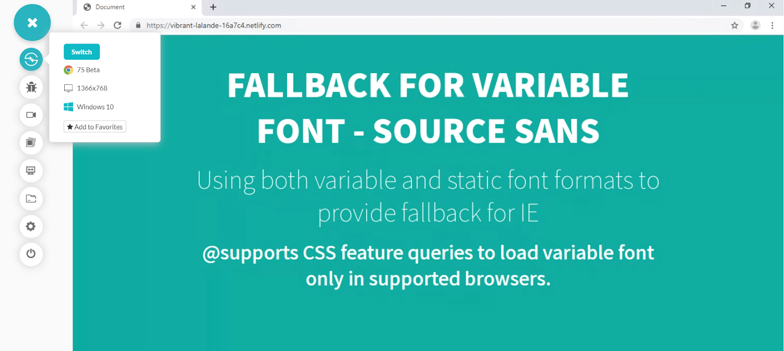
Source Sans variable font is supported by Chrome displaying multiple ‘wgth’ weight axis values from a single variable font file. Now, we have a look at Internet Explorer 11.
Source Sans variable font not supported in IE . 2 static font files – Source Sans ‘regular’ and ‘bold’ are loaded as fallbacks. If you want to learn more about feature detection using the @supports CSS feature queries.
Resources
There are two amazing tools that I would recommend where you can discover and experiment with variable fonts before incorporating them into your project:
Related Articles
Published at DZone with permission of Nikhil Tyagi, DZone MVB. See the original article here.
Opinions expressed by DZone contributors are their own.

Comments