How To Create an Analytical Dashboard With Next.js: Airline Dashboard Example
In this tutorial, learn about constructing a dashboard and creating a pivot table and charts in the Next.js app based on the example of an airline company.
Join the DZone community and get the full member experience.
Join For FreeFor the last several days, I’ve been working on one of my pet projects for my portfolio. To be precise, I have been creating an analytical dashboard for an airline company. Finding suitable tools turned out to be a challenge. I wanted to use Next.js in the stack, and my goal was to make sure any user could understand the presented statistical data and, secondly, interactively explore the information. So, in this tutorial, I will cut my way through constructing the dashboard and creating a pivot table and charts in the Next.js app on the example of an airline company. Hopefully, it will save you time :)
Prerequisites
Here, I would like to share all the things I did to prepare for creating the essential statistics. And we will start with…
Analyzing the Subject Area
As a base, we will use a free, accessible dataset on landings of a major airport in the United States — San Francisco International Airport.
Firstly, we have to analyze the subject area and understand what insights we are looking for. Let us imagine ourselves as airport executives. We have hundreds of arrivals and departures of different types, scales, airlines, etc. What do we likely wish to learn? The efficiency of our establishment indeed. So, I selected some lead aspects for this field:
- landing frequency,
- landing time,
- aircraft manufacturer models in use,
- flight geography,
- landed weight.
Final Dashboard
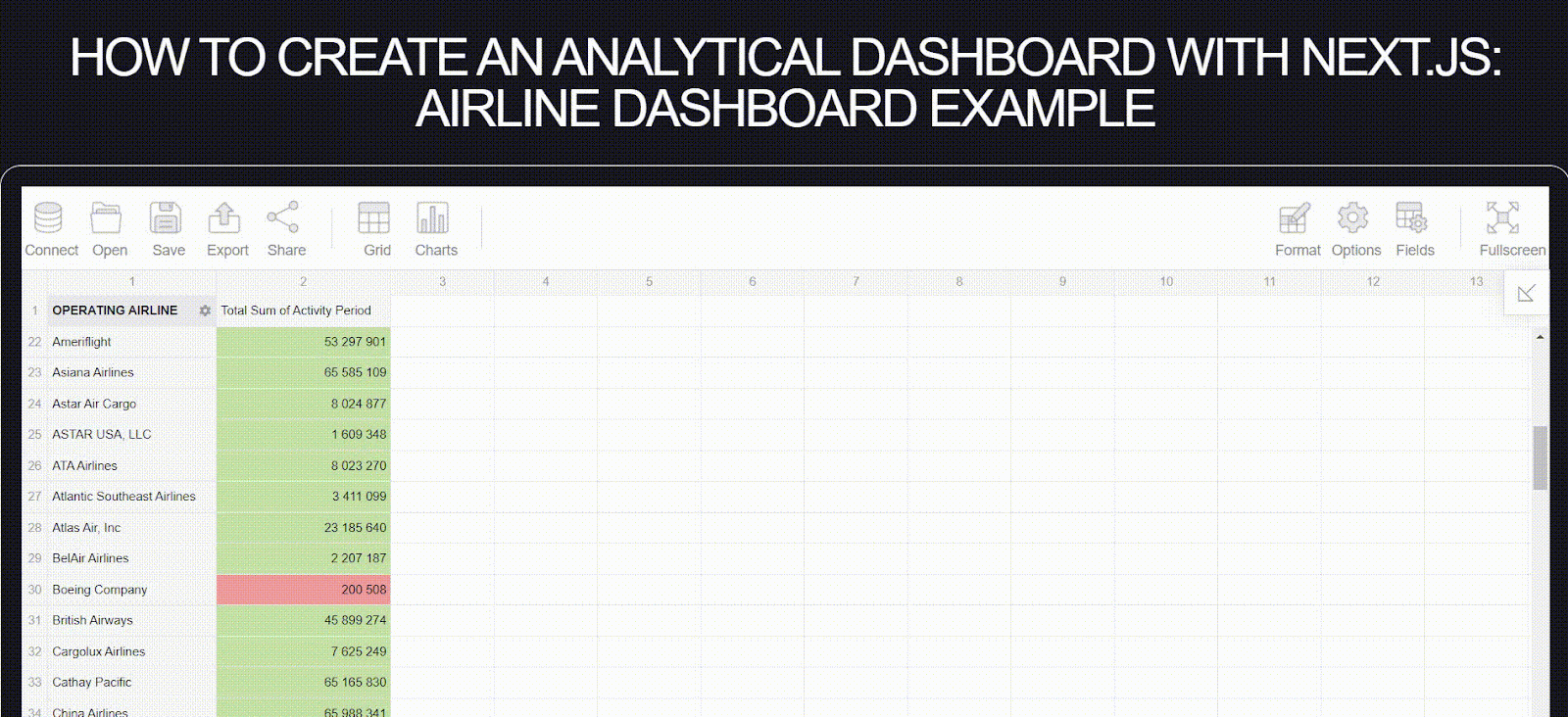
As we get through this tutorial, we will gradually create an interactive dashboard and, more importantly, learn to create it with Next.js. Our finished page will contain a pivot table and plenty of different charts.
Tools
A large number of data requires powerful means to display it. So, I surfed the Internet and finally focused on the most suitable ones for my needs. I created a pivot table with Flexmonster and charts with Highcharts. Luckily, these two libraries are super user-friendly, customizable, fine-integrated with each other, and, more importantly, well-deployed on Next.js.
By the way, this article on the best tools for reporting in React was really helpful in making my choice.
Now, let’s dive into the integration process.
Connecting Highcharts and Flexmonster to the Next.js App
It’s time to figure out how to launch these cool shapes and tables on the computer. So:
1. Install Flexmonster CLI
npm install -g flexmonster-cli
npm install highcharts highcharts-react-official
2. Open your Next.js project or create it by running two lines
npx create-next-app flexmonster-project --ts --app
cd flexmonster-project
3. Get the Flexmonster wrapper for React:
flexmonster add react-flexmonsterGot it! Since you install libraries, let’s move further, embedding them into the project.
4. Import Flexmonster to global.css:
@import "flexmonster/flexmonster.css";
5. Create a separate file PivotWrapper.tsx connecting Flexmonster and Highcharts as well. It will be a wrapper for our future pivot table:
'use client'
import * as React from 'react';
import * as FlexmonsterReact from "react-flexmonster";
import Flexmonster from 'flexmonster';
import "flexmonster/lib/flexmonster.highcharts.js";

// A custom type so we can pass a reference along with other Flexmonster params
type PivotProps = Flexmonster.Params & {
    pivotRef?: React.ForwardedRef<FlexmonsterReact.Pivot>;
  }

// The pivotRef can be used to get a reference to the Flexmonster instance so you can access Flexmonster API.
const PivotWrapper: React.FC<PivotProps> = ({ pivotRef, ...params}) => {
    return (
        <FlexmonsterReact.Pivot
            {...params}
            ref={pivotRef}
        />
    )
}

export default PivotWrapper;
6. Import the wrapper into your page. You can name it in your way, but I did it in pivot-table-demo/page.tsx:
"use client"
import * as React from "react";
import type { Pivot } from "react-flexmonster";
import dynamic from "next/dynamic";
import * as Highcharts from 'highcharts';
import HighchartsReact from 'highcharts-react-official';


// Wrapper must be imported dynamically so that Flexmonster is loaded only when the page is rendered on the client side. Learn more about dynamic imports in Next.js.
const PivotWrap = dynamic(() => import('@/app/PivotWrapper'), {
    ssr: false,
    loading: () => <h1>Loading Flexmonster...</h1>
});

const ForwardRefPivot = React.forwardRef<Pivot, Flexmonster.Params>((props, ref?: React.ForwardedRef<Pivot>) =>
    <PivotWrap {...props} pivotRef={ref} />
)

ForwardRefPivot.displayName = 'ForwardRefPivot';
7. Insert PivotWrapper component and Highcharts into your page as shown below:
export default function WithHighcharts() {

    const pivotRef: React.RefObject<Pivot> = React.useRef<Pivot>(null);

    const reportComplete = () => {
        pivotRef.current!.flexmonster.off("reportComplete", reportComplete);
        //creating charts after Flexmonster instance is launched
        createChart();
    }

    const createChart = () => {
        // we will define charts here later
    }

    return (
        <div className="App">
            <div id="pivot-container" className="">
              <ForwardRefPivot
                ref={pivotRef}
                toolbar={true}
                beforetoolbarcreated={toolbar => {
                  toolbar.showShareReportTab = true;
                }}
                shareReportConnection={{
                  url: "https://olap.flexmonster.com:9500"
                }}
                width="100%"
                height={600}
                report = {{
                  dataSource: {
                    type: "csv",
                    // path to the dataset of San Francisco Airport Landings
                    filename: "https://query.data.world/s/vvjzn4x5anbdunavdn6lpu6tp2sq3m?dws=00000"
                  }
                }}
                reportcomplete={reportComplete}
                // insert your licenseKey below
                licenseKey="XXXX-XXXX-XXXX-XXXX-XXXX"
              />
          </div>

          // we will insert charts below later
    )
}
9. Build and run the app:
npm run build
npm start
You can explore more about the integration of Flexmonster with Next.js and Highcharts in Flexmonster documentation.
The pivot table is ready; the charts are in line!
Setting Chart Configuration Up
In this tutorial, I use pie, bar, column, areaspline, and scatter charts. It sounds like a lot, but Highcharts has even more chart types to propose. It is also possible to customize them to your liking. Further, I will tell you the overall chart-defining process for any chart and emphasize some important points.
1. Insert Highcharts into your page
Now, move down to the return() section. Here, you describe your page layout. You will insert Highcharts into <div> blocks. So, create the first one <div> block and enter its `id`. For example, my chart tells about landing frequency by aircraft type. So, I name it as ‘chart-frequency-aircraft’:
<div>
  <p>By Aircraft Type</p>
  <div className="chart" id="chart-frequency-aircraft"></div>
</div>
2. Define the chart options
Chart configuration must be initialized inside the createChart() function. Highcharts is accessed by Flexmonster PivotWrapper, as it dynamically receives data from the component. You have created the chart container; now describe the diagram’s appearance. Here are my defined options for the second pie chart in this tutorial:
//Running Flexmonster's getData method to provide Highcharts with aggregated data
pivotRef.current!.flexmonster.highcharts?.getData(
  {
    type: 'pie',
// see the list of types on Highcharts documentation: https://www.highcharts.com/docs/chart-and-series-types/chart-types)

    slice: {
      rows: [
        {
          // Here you type the name of the row in dataset
          uniqueName: 'Landing Aircraft Type',
        },
      ],
      measures: [
        {
          // Here you type the name of the row in dataset
          uniqueName: 'Landing Count',
          // You can use aggregation functions as well
          aggregation: 'count',
        },
      ],
    },
  },
    (data: any) => {
      // Replace ‘chart-frequency-aircraft’ with necessary <div> id for other charts
      Highcharts.chart('chart-frequency-aircraft', data);
    },
    (data: any) => {
      Highcharts.chart('chart-frequency-aircraft', data);
    }
);
If you want to customize your chart, you can do it by accessing data properties inside (data: any) => {} function. For example, I created an inner hole inside the pie chart to create a custom donut chart by adding these lines:
(data: any) => {
      data.plotOptions = {
        pie: {
          innerSize: '50%',
          dataLabels: {
            enabled: true,
            format: '<b>{point.name}</b>: {point.percentage:.1f} %',
          },
        },
      }
      Highcharts.chart('chart-frequency-aircraft', data);
    },
Be careful! You should change data before it passes to the Highcharts.chart() function as a parameter.
Other charts can be created similarly. You can see more examples on the Highcharts demo page. You can also read more about different properties in its official API documentation.
In the following sections, we’ll go deeper into analytics and chart choice and share some insights.
Running Through the Dashboard
We are already familiar with the subject area, so let’s explore the dashboard deeper, considering the lead aspects of the airport workflow.
Landing Frequency
The partnership between airports and airlines is quite important as it affects the income of both. Understanding leading airlines can help servicing companies establish business relations. An airport is able to manage landing fees, its own policy, and so on. If you want to explore airport-airline relations more deeply, welcome to the nice article here.
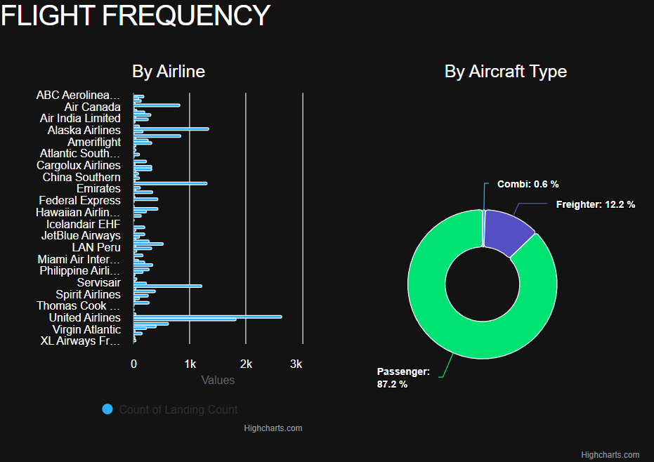
To analyze the flight frequency by airlines in the airport, I chose a bar chart as it contains a lot of members to show, and I can conveniently compare the quantitative difference. Besides the apparent domination of United Airlines, we can see that Emirates (Dubai) and Servisair (United Kingdom) are among the leaders in landing count.
When analyzing the flight frequency by aircraft type, I preferred the donut chart since this chart best reflects the percentage relationship. Plus, we have only three members, so with the donut chart, it’s much easier to perceive how much passenger flights dominate over freight transportation.
Hmm, what about more detailed analytics? Here is a shining moment of Flexmonster Pivot. Let’s quickly set it up and configure the desired report!
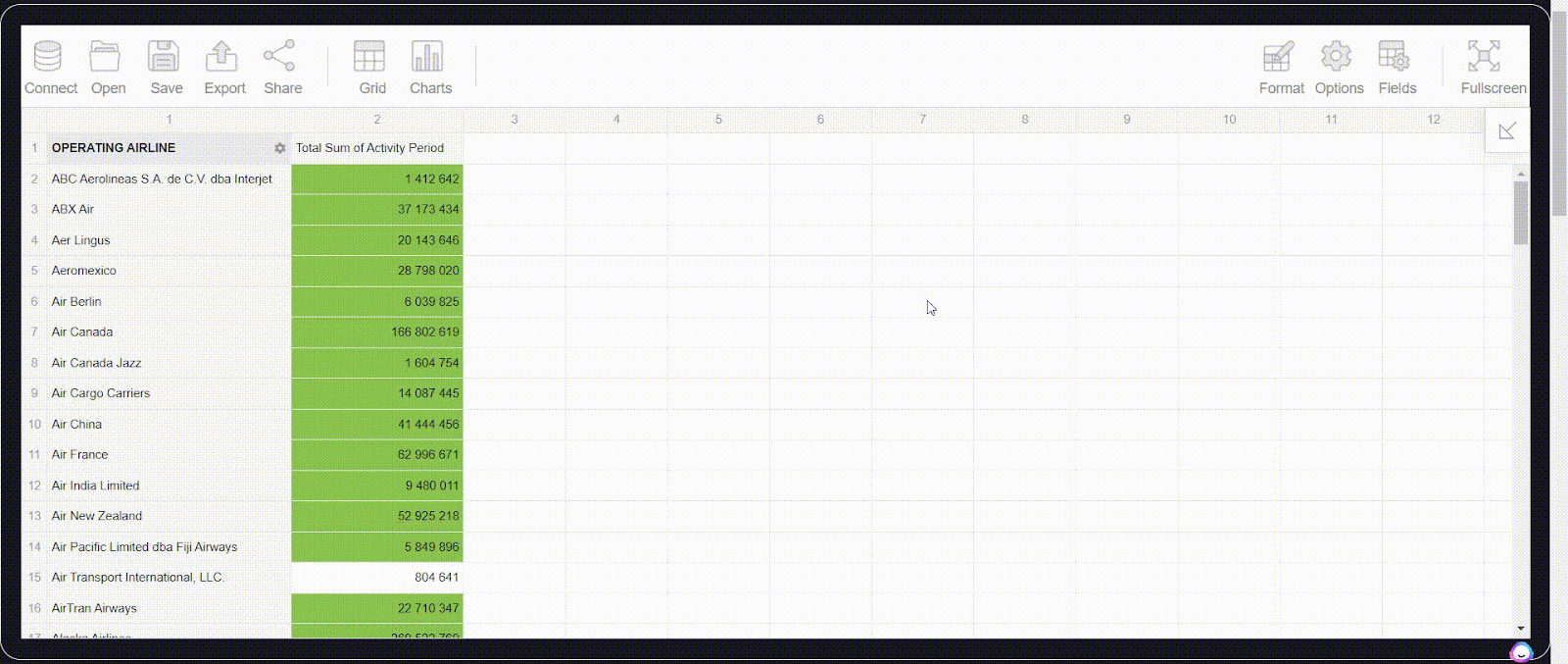
And now, we are able to see landing activity by airlines chronologically.
I will clarify my purpose. Here, I highlighted the landing count in green color when an airline served 1 million flights or more. If it did less than 600k, the cell is yellow and red if it did less than 300k. The value is acceptable if it ranges between 600k and 1 million. From here, I can notice the greatest and lowest airline activity periods. I did it using the conditional formatting feature built into the Flexmonster pivot table. Any user can add personal conditions, format text inside the cells, and set their own data appearance right from the UI.
Landing Time
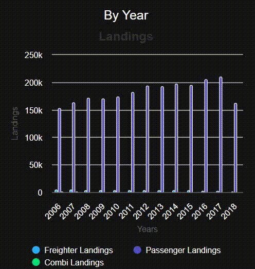
This analytics discovers relations between landings count and either year shift or month shift. First, we see how the landings count changes from year to year. By selecting different types of aircraft bodies on the column chart, we can see the dynamic of landings and evaluate each value by year.
Zooming in and out, we can see that passenger transportation is steadily growing while cargo and combined transport are losing their relevance.
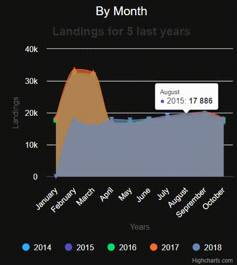
How does jet activity change throughout each year? Another way to display value shifts throughout a year is to use areaspline chart. I can observe how different periods take their share in the total landing count. Obviously, the activity peak is in February and March.
Aircraft Manufacturer Models in Use
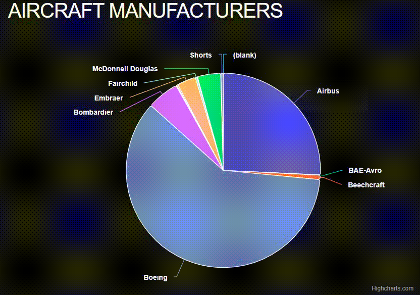
An airport should be familiar with the specifics of the vehicles it works with as they can need some service while waiting in the terminal. The following chart displays the distribution of aircraft manufacturers in San Francisco airport operations. Since I selected the pie chart, it’s clear to notice Boeing’s and Airbus’s dominance compared to others. Here are some smaller producers, like Bombardier, Embraer, and McDonell Douglas.
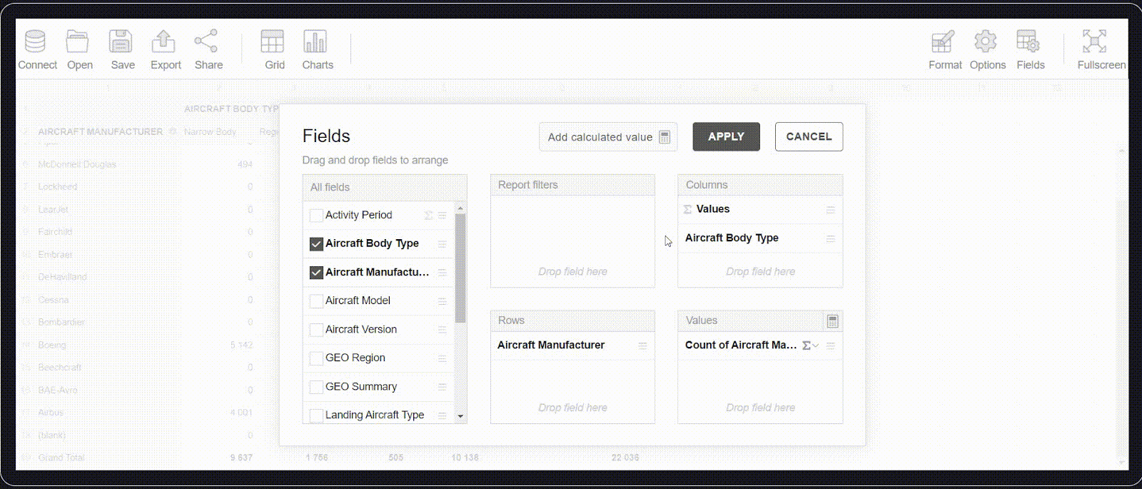
I also analyzed these statistics dynamically in Flexmonster Pivot. For this purpose, I selected some related fields in the pivot table. Here, I can sort alphabetically A-Z. In addition, I switched to “Charts” mode and smoothly inspected manufacturer distribution by aircraft body type. Highcharts provides cool interactive charts, while Flexmonster allows you to configure new slices and change visualizations right on the fly.
Flight Geography
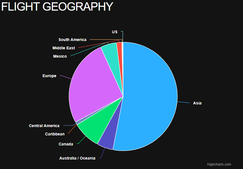
Here, we inspect the geography of flights to spot which flight directions are more relevant for this airport. Over half of the flights connect the airport with Asian countries, and another quarter with European ones.
Landed Weight
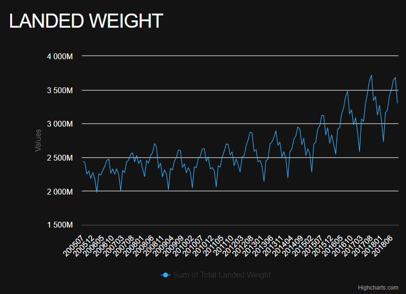
The last aspect is the landed weight. Firstly, we examine values by each month of the entire period of observations. Note that dates are provided in the format "YYYYMM" in the dataset, so they are presented the same way on the horizontal axis in the visualization. I want to see the shape of the values shift, so I chose a line chart for it. It is more concise than a column chart when we work with a lot of data. So, we see how the landing count changed from 2005 to 2018 and notice profitable and unfavorable months.
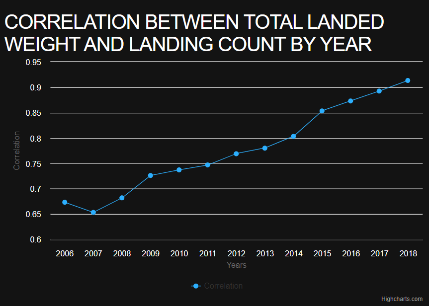
Another statistic is quite distinctive. It is a correlation (i.e., the strength of the relationship) between landed weight and landing count. This value ranges from -1 to 1. The closer it is to 1, the more one value depends on another. Finally, the last chart tells us the flight efficiency dynamic year by year.
Full Demo Link
You can check out the full Next.js demo app and explore the dashboard yourself on my GitHub.
Final Words
In this tutorial, we have created an interactive statistical dashboard, analyzed the work subject, and processed the dataset. We have also noticed some specifics in configuring Highcharts and working with the Flexmonster table. Don’t forget that in order to use the full potential of these components.
To sum it up, I really enjoyed composing analytics in the field of flights. Its data turns out to represent lots of versatile features. Additionally, I was surprised by the lack of appropriate tutorials on Next.js. So, I did this article and hope it will help you share analytical data easily. I wish you good luck in your future search!
Opinions expressed by DZone contributors are their own.

Comments