Fear and Loath Building Data Lineage
Discover how intuitive product designs reshape the approach towards understanding complex data flows and enhancing user experience.
Join the DZone community and get the full member experience.
Join For FreeI want to share something candidly here: when initially talking to the data teams about lineage, eight out of ten would ask me, ‘Why would we not display all the interconnections they have at their data warehouse on one screen?’ Honestly, this always confused me because I did not understand what problem they were trying to solve with this. It will likely look like a few, not interconnected nodes, or more likely a mess, which would overlay our backend…
This also led me to reflect on Henry Ford’s remark about faster horses, making me realize that this quote is as true now as it was in the past.
While we were crafting the UI for the Masthead, we couldn’t help but notice a troubling trend: B2B data products seem to fundamentally ignore their end users’ experience. My point is, within our niche, it’s not the data engineers — who actually interact with our products — making the buying decisions. Instead, it’s the data directors or VPs of Data whose eyes are more often on the P&L statements and spreadsheets. I mean, the user experience is not the first priority in their decision-making when buying a solution. Despite this reality, we remained adamant in our refusal to sacrifice the quality of the UX and UI for the end users.
The challenge is that data lineage is a very specific beast, to say the least. Hear me out; if you think about products as less abstract than data, for example, food delivery service, e-commerce, education, and even fintech, those products are used by all designers. Let’s say they know them and understand the job to be done much more easily than working with data flows, ETLs, datasets, views, or whatever. So, even if the designer cannot understand the product, they are likely to be sent to work in the support department to flex their emotional muscles and better understand the end user and the Job To Be Done (JTBD), while that is not something they can do instantly with data lineage and data engineering jobs.

In our case, Nastiia, our designer, navigated through concepts that were quite abstract for her. It was like trying to explain complex ideas to a grandmother. The challenge doesn’t solely lie with the listener; it’s equally about the clarity and effort of those explaining. To put it into context, the founders have deep technical expertise, having spent their entire careers in data, while Nastiia — our product designer, was newly introduced to the exciting and shiny world of ETLs, jobs, queries, columns, runs, and so forth. In essence, it required a significant effort from all of us to bridge that gap and truly understand each other.
The thing that we found working for us is developing a shared metaphor, which is close enough to connect everyone’s understanding. Plus, we all assumed that this task had already been solved somewhere, not necessarily in data. We are not the first ones trying to map difficult, unique, and distributed entities on a large scale.
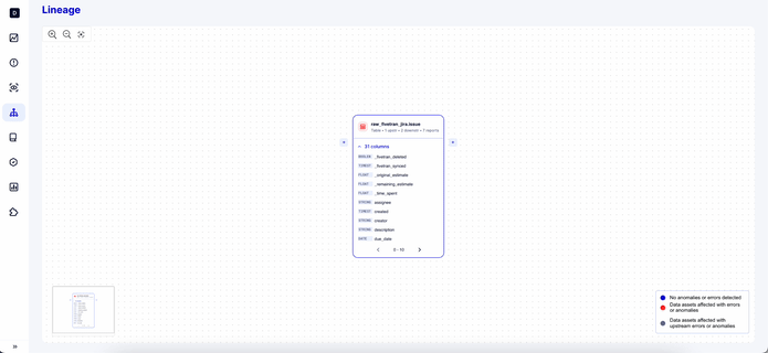
For us, the solution was to view data lineage as a world map, more precisely, Google Maps. We were striving for an instrument that could solve search problems across different scales. We were looking for a solution that changes the context and easily zooms in and zooms out, quite literally in our case. From the start, it was understood that you can search for anything in data lineage, very much the same as in Google Maps. However, this does not mean that you can see everything at once; for example, you cannot see a specific street at the world or country level; you need to search within a particular context, like a city. This also means that the instrument needs to be flexible enough to support different contexts.
Navigating through data flow resembles charting a journey on Google Maps from point A to B, then on to C. Tracing the path of a specific column from one table through to a view, and finally to its destination in the dashboard, requires precise context, much as you can’t expect to navigate the details of a street on the scale of a continent in Google Maps.
Also, what’s important about lineage is that it contains tons of information (upstream, downstream tables, dashboards, whether it’s a table, view, or big table, number of columns, and the list goes on). It’s really easy to follow this desire to provide as much information as we have as possible, but lots of info actually dilutes the user’s attention and often results in a failed JTBD (Job To Be Done), where we’re not helping data engineers but bombarding them with hundreds of new data points they were not asking for. Balancing this on the lineage was challenging for us, especially given the fact that each table can have its own unique upstreams and every lineage can grow into an infinity of jobs and tables on the screen, which no one actually needs, rather than understanding a particular data flow.
We were fortunate because Nastiia quickly grasped that understanding data fundamentals was crucial to developing empathy for our users. We hold a core belief: we can only create something truly valuable if it’s loved by our users. This belief drives us to foster a shared understanding within our team while seeking inspiration from best practices observed in products like Intercom, Mixpanel, and Dropbox. These products have shown us that complex and unintuitive tasks can be accessible and user-friendly. They serve as a reminder that pursuing an elegant UI should not come at the expense of the user experience but rather should fulfill the user’s needs effectively.
Published at DZone with permission of Yuliia Tkachova. See the original article here.
Opinions expressed by DZone contributors are their own.

Comments