Demystifying Grids For Developers and Designers
UX/UI trends come and go - but one constant, and constantly overlooked, aspect of design optics today are data grids. Let's discuss why is that so?
Join the DZone community and get the full member experience.
Join For FreeDesigners and developers each have their own individual definition and use of grids, making the concept a relatively nebulous and unclear concept to all. To some, grids could mean layout and structure, while to others grids refer to interactive tables that manage data. Understanding the target audience is key here because there might not be a universally understandable direction which can lead designers to be misguided during the cross-collaboration process. When given the time, developers and designers can fully evaluate the user story and create a thoughtful user experience together through the use of grids. But first, we need to find common ground to work from.
Identifying a Grid
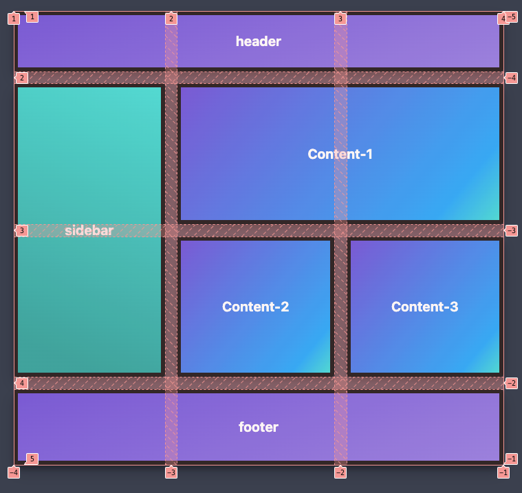
As we mentioned, it is important to know your audience when talking about Grids. If you come from a typical design background, the word “Grid” instantly brings you to think about layout (either print or online). The term has even penetrated CSS with the Grid Layout. As you can see in this article, that demonstrates the use of the term “Grid” generically for design layout purposes.
Before we dive into identifying Grids and their purpose, we should define what we mean (and others) when they say this term.
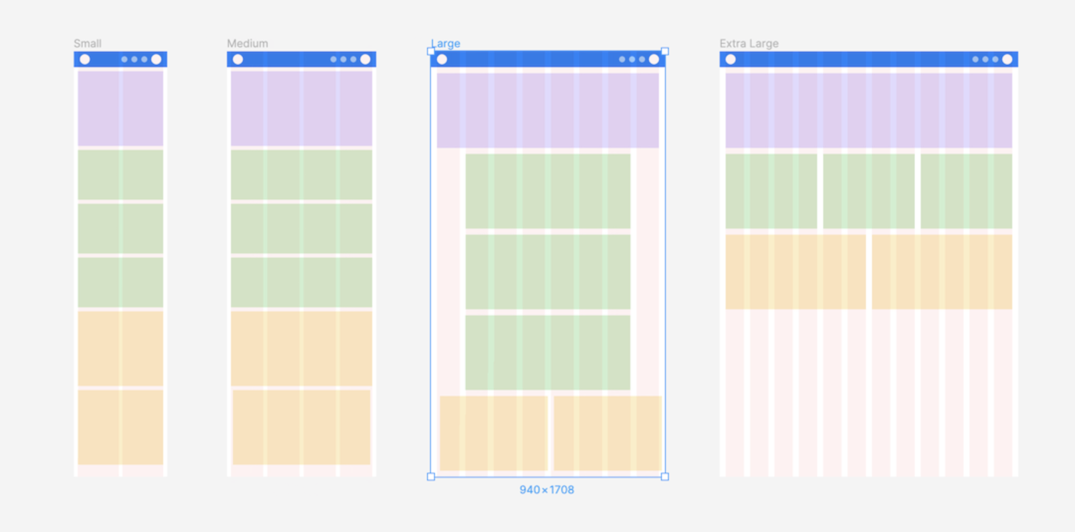
*Design Background Grid Term: Typically refers to a framework of intersecting horizontal and vertical lines that help you to structure your content evenly.
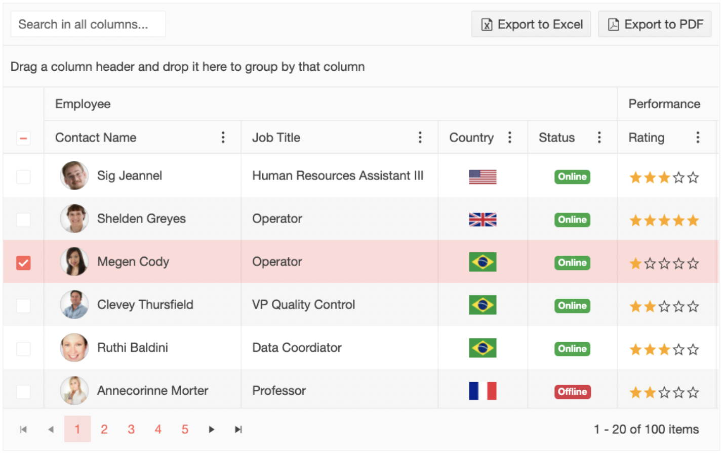
Data Grid Term: The term Grid in other circles can refer to a table of content with features such as sorting, filtering, and even virtualizing data.
Front-End Web Grid Term: This can either mean the design term, the data-grid term or be used as a shortcut to reference the CSS Grid that can be used for laying out content on the web.
A grid can be a simple chart, with flexible or fixed capabilities. It can be bound to various data sources or features like sorting, filtering, and endless scrolling. Whatever the use is, a solid layout is the cornerstone of a grid with a clear and intent purpose. We wanted to spread awareness for the different meanings “Grid” has while also clarifying which Grid we are referring to.
The Purpose of Grids
Grid components don't have to have the bells and whistles to support every possible potential use case, especially if it's a bit of a stretch. There is a tendency to over-use of the data grid because "the requirements call for it.”
A part of demystifying grids is identifying how people are using them and what features are required for a grid’s purpose. Grids can play a larger part in UX trends with brand storytelling and organizing information with formatting while also identifying the target audience with certain UI designs.
- Designers have to evaluate the goals of using a data grid and see if there are potentially other ways to build the holistic user experience. Many times, it doesn't have to be all driven within the grid itself.
- Developers and designers should also keep mobile in mind. There are plenty of examples out there of responsive web apps that still show a data grid on a mobile device and force the user to scroll horizontally and vertically.
Features on Features
When talking specifically about a Data Grid, there is a wide range of features developers and users might expect to come with their large amount of data. Assumed features that all Grids provide are the ability to bind data to the cells and maybe even the ability to edit that data. Additionally, I’ve outlined a list of commonly seen features with definitions and gifs. These examples are shown using Kendo UI’s Data Grid but many other Data Grids share these commonly hoped for features.
Common Column and Row Features
- The ability to populate columns/rows with data
- The ability to hide columns/rows
- The ability to lock columns/rows
- Sticky columns/rows that are visible at all times while the users scroll
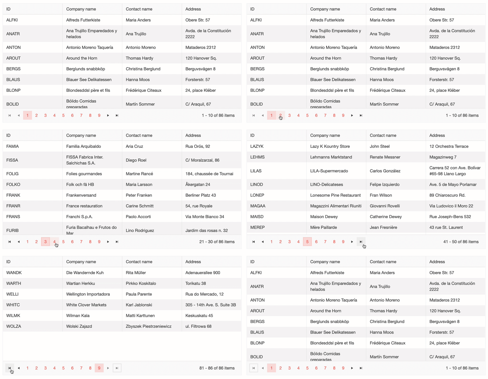
Paging
The ability to split your long list of Grid data into multiple pages.
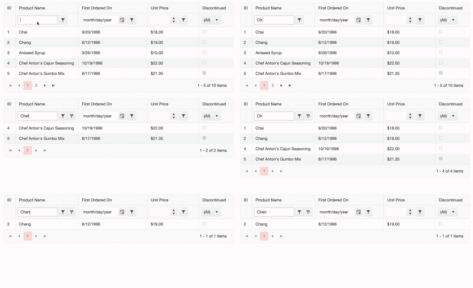
Filtering
The ability to display only those Grid records which meet specified criteria.
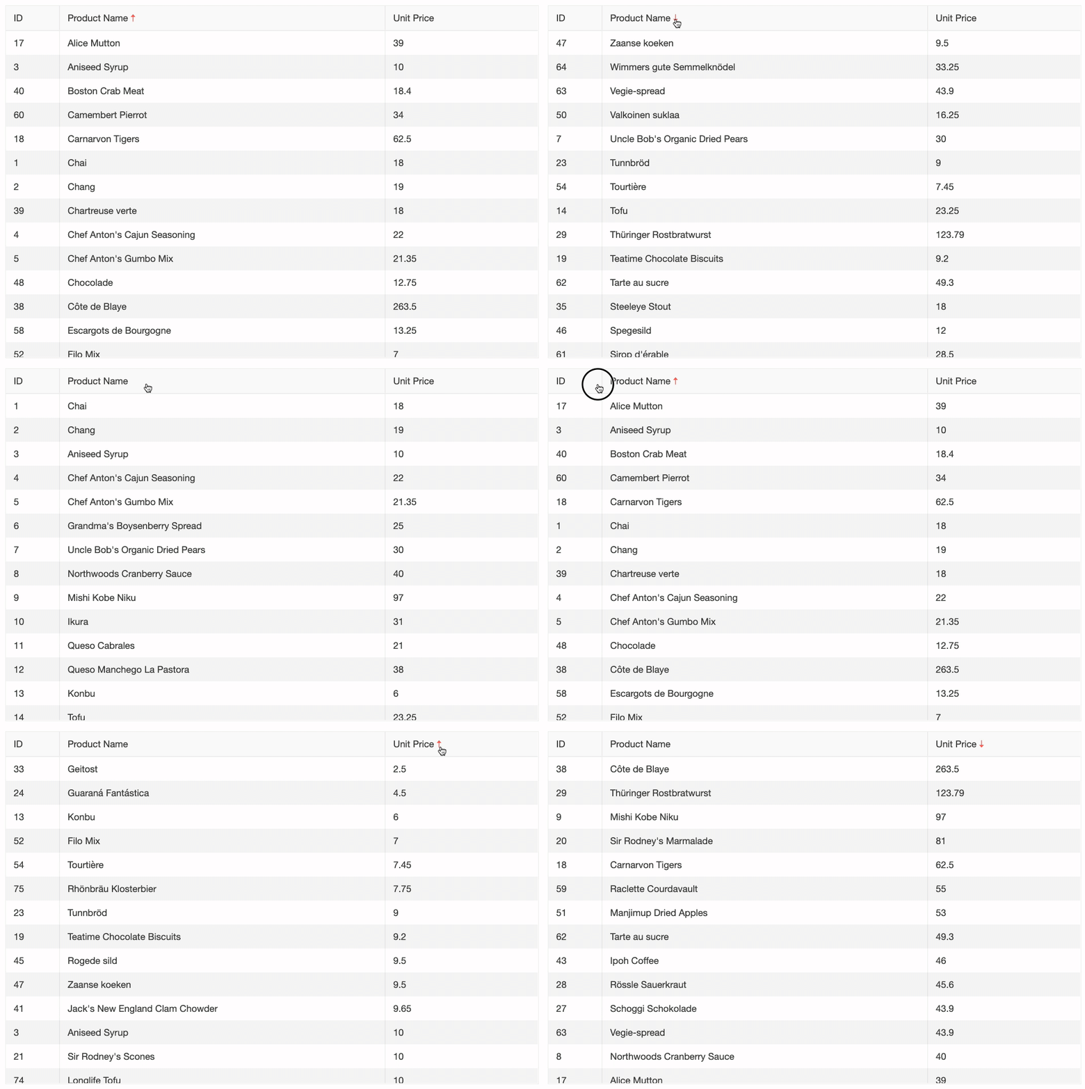
Sorting
The ability to sort single and multiple data-bound columns in ascending or descending order.
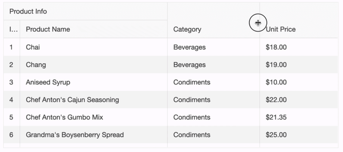
Spanned
This feature allows content to span over multiple cells of data.

Resizing
The ability to resize a Grid’s columns by dragging the edges (resize handles) of the header cells.
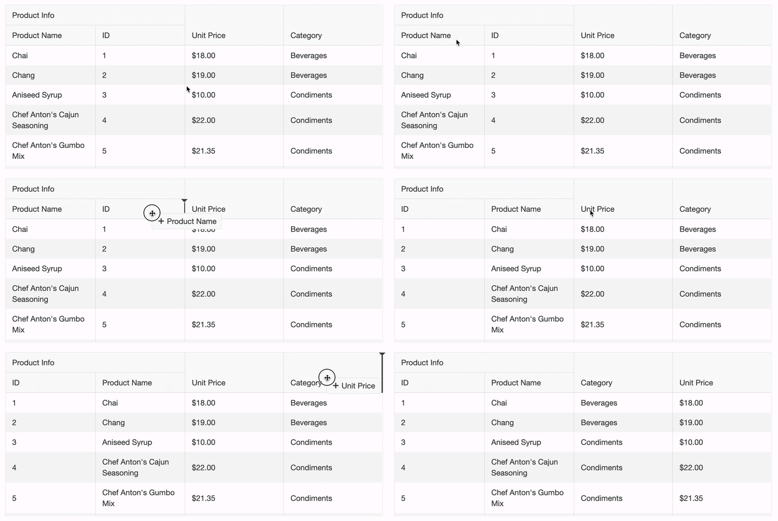
Reordering
This feature is the ability to reorder its columns by dragging the header cells.
Why Grids Matter
From DesignOps teams to developers, grids can have many functions, but the overall UX and how it drives forward the business is what matters most. Interactive design is vital in giving the consumer a satisfying UX experience.
- 88% of users do not return to a website with a bad user experience (Source: Toptal).
- Stakeholders only understand that there's a problem to solve when it comes to design but don’t always give direction to developers on how to present data to users - which can cause conflict.
- Designer and developer teams should align on a strategy to ensure a mutual understanding of how grids are defined and used within their own organization and cross-functionally. The result is a more consistent, cleaner design, which elevates the brand value.
Opinions expressed by DZone contributors are their own.

Comments