Custom Container Component in React Native With Different Content and Style
Join the DZone community and get the full member experience.
Join For Free
In React Native (and also in React) you can create custom components and use them easily as much as you want in your app. You may give custom styles and values to these components by passing different values in the props of these components. However, you can not change the child components of your custom components since they are already defined.
In some cases, you may want to have containers that look alike but also have different content and differ in style. At this point, custom container components come in.
Let's create a custom container with the name, "BoxContainer."
xxxxxxxxxx
import React from 'react';
import { StyleSheet, View} from 'react-native';
const BoxContainer = props => {
return (
);
};
export default BoxContainer;
We want to add style to our container. The style we will give to our custom container component will be the common style in every usage of our component. So, let's modify our code to return a view with some style.
xxxxxxxxxx
import React from 'react';
import { StyleSheet, View} from 'react-native';
const BoxContainer = props => {
return (
<View style={styles.boxContainer}>
</View>
);
};
const styles = StyleSheet.create({
boxContainer:{
shadowColor: '#000',
shadowOffset: { width: 0, height: 2 },
shadowOpacity: 0.8,
shadowRadius: 2,
height:200,
margin: 20,
alignItems: 'center',
justifyContent: 'center'
}
});
export default BoxContainer;
Since our component will be a container, it will contain different components when used. We need to pass these components to the container. This can be achieved with React's "children" prop.
x
{props.children}
We also want to pass custom style to the container. As you know, this can be passed by props.style. The problem here that must be handled is that we must combine the common style built in the component and the style passed to the component during usage. We must also allow the common style to be overwritten by the style passed during usage. We can achieve this with the spread operator in JavaScript.
x
{styles.boxContainer, props.style}
With the help of the spread operator, the style values of boxContainer and style are combined and passed up as a new list.
xxxxxxxxxx
import React from 'react';
import { StyleSheet, View} from 'react-native';
const BoxContainer = props => {
return (
<View style={{styles.boxContainer, props.style}}>
{props.children}
</View>
);
};
const styles = StyleSheet.create({
boxContainer:{
shadowColor: '#000',
shadowOffset: { width: 0, height: 2 },
shadowOpacity: 0.8,
shadowRadius: 2,
height:200,
margin: 20,
alignItems: 'center',
justifyContent: 'center'
}
});
export default BoxContainer;
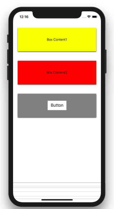
Now, our custom container component is ready to be used. Let's use it with different content and style and see the result.
xxxxxxxxxx
import React from 'react';
import { Button, StyleSheet, Text, View } from 'react-native';
import BoxContainer from './components/BoxContainer';
export default function App() {
return (
<View style={styles.page}>
<BoxContainer style={styles.container1}>
<Text>Box Content1</Text>
</BoxContainer>
<BoxContainer style={styles.container2}>
<Text>Box Content2</Text>
</BoxContainer>
<BoxContainer style={styles.container3}>
<View style={styles.button}>
<Button title='Button' color='black'/>
</View>
</BoxContainer>
</View>
);
};
const styles = StyleSheet.create({
page:{
flex:1,
paddingTop:50
},
container1: {
backgroundColor: 'yellow',
height : 100
},
container2: {
backgroundColor: 'red',
height : 100
},
container3: {
backgroundColor: 'grey',
height : 100
},
button:{
width:80,
height:40,
color: 'white',
backgroundColor: 'white'
}
});
And the result:

Further Reading
Opinions expressed by DZone contributors are their own.

Comments