COVID Risk Modeling Using Tableau Visualization
Learn how to use Tableau to combine, organize, and visualize data.
Join the DZone community and get the full member experience.
Join For FreeA lot has happened in the last few years since the World Health Organization declared COVID-19 as a global pandemic, forcing every business to change the way they work to survive in this changing world. However, even though the lockdown slowed everything, still a huge amount of data continued to climb with speed, and big data grew and become even bigger.
As the world was changing and businesses were struggling to find new innovative ways and methods to continue doing business, data, and data analytics have provided a path of light. In this paper, an overview has been provided about Tableau, an extremely powerful tool that can crunch massive amounts of data and can provide hidden insights and trends through visual solutions that can be used by organizations to make quick business decisions. I have used Tableau to generate interactive visualizations to provide a solution for the biotech/pharma/healthcare industries about an improved method of doing peer-to-peer engagements.
As the Covid infection rate is going down and businesses are opening, the healthcare industry needs to understand the risk due to COVID before engaging with HCPs (healthcare professionals) in a live setting and doing peer two peer programs. COVID-19 open-source data has been utilized to provide the real-time COVID impact in a geographical location with accuracy, which could be monitored by companies to prepare for possible face-to-face engagements and find quick and innovative solutions to continue to make effective healthcare decisions.
Introduction
As a very needed integral process for the pharmaceutical/biotech industry, companies run a lot of HCP-related peer-to-peer programs, which are face-to-face meetings, conventions, and conferences to educate the HCPs (Health Care professionals) about the company's drug and different scientifically proven and approved treatment options [1].
During COVID, all the interactions and companywide conferences went virtual, even one-to-one field sales reps/KOL (Key Opinion Leader)/MSL (Medical Science Liaison) and HCP meetings became virtual, which impacted the business. Today when life is slowly going back to normal, and as the COVID infection rate is going down and businesses are opening, it is important for the healthcare industry to understand the risk score due to COVID before engaging with HCPs in a live setting and for doing peer-to-peer programs.
This paper uses publicly available COVID infection data and census bureau population data [6,7] together to present a model to calculate whether a particular location in the US is safe or unsafe to have a face-to-face meeting. This is an interactive visualization created using Tableau as a business intelligence tool.
Interactive Data Visualization
Data visualization is the presentation of data or information in a visual format such as a graph, chart, diagram, etc. Today ever-increasing data volumes are making already multifaceted big data even bigger and more complex. As a result, sorting, cleaning, comprehending, and explaining a huge amount of data is becoming more and more slow and difficult.
This is where, to make data-driven decisions quickly and confidently and in real-time, data visualization has come into play. It provides the fastest and most effective way to interpret large batches of data and communicate pertinent details and insights by creating compelling, informative, beautiful, and eye-catching dashboards. Visualization uses a human’s natural skills to perceive and process visual information with higher efficiency compared to tabular data format [8]. It helps to monitor and deal with complex information at a glance and enhances memory [8], significantly helping to communicate messages more effectively.
However, visualizations are static by nature and are used to publish materials such as publishing in print or online or for presentation purposes rather than exploration. Thus, it makes a difference when a visualization is created using interactive dashboards, interactive data visualization being a powerful tool in the current age reaches beyond the limits of static dashboards. It converts static presentations into interactive sessions and makes the dashboards dynamic and empowers the users to interact with the data and discover patterns and trends by filtering the data on-demand or by simply clicking to drill down into the underlying data to gain quality insights in real-time.
Data Preparation
The data for this paper is collected from the public domain. Two separate datasets have been used, first is the publicly available COVID infection data. The data is released and updated in real-time by the New York times and provided in three separate CSV files for three geographical areas: US, States, and Counties [6]. The counties file is the most detailed file including the state and country columns as well. Unlike the other two files, which are aggregated data sets. Second is the US census bureau population data from the U.S. Census Bureau website [7].
For the COVID infection CSV data, only the counties file is downloaded from the website. A table is created in AWS Redshift and the file is uploaded to the table in Redshift. A script is created to load this data daily into the Redshift table, which is then automatically refreshed in the Tableau Dashboard. Figure 1 shows the table in Redshift with the COVID data uploaded from the Web.
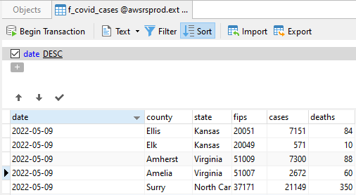
Figure 1: COVID Infection Data in a long table format in Redshift.
The COVID table in Redshift is connected to Tableau through the Tableau server connector. Figure 2 shows the Tableau connector page, with a list of a variety of common files and server types from which Tableau could be connected to pull data.
 Figure 2: Tableau Desktop Connector page showing a variety of basic file and server types.
For this data set, “Amazon Redshift” under ‘’To a Server” is selected and clicked. This opens a window shown in Figure 3 to input credentials and other details about the server. A live connection is established after entering the server and login details. And all the schemas and tables in the data warehouse could be seen in the data source pane in Tableau Desktop. From where the COVID table is dragged and dropped into the data connection section.
 Figure 3: Window Box to enter Connection details to connect to the AWS Redshift Datawarehouse.
The population data is also downloaded as a CVS file from the US Census Bureau website. The demographic data is updated weekly on this government website. This excel file is connected to Tableau directly. The above Figure 2 shows the list. In this case “Microsoft Excel” under “To a File” is selected, which opens a dialog box that shows the excel supported files in the local system. The dialog box helps to navigate to the excel file and after the selection, Tableau establishes a live connection with the file.
Tableau Data Join
Tableau now is connected to two different data sets from two different data sources, it offers the option to combine/join both data sets using the common field present in both. As figure 4 shows, both the tables are joined using inner join using the ‘COUNTY’ column which is the county id present in both the datasets. Join being a robust function, once created, it will exist in the entire workbook and any number of worksheets or dashboards could be created using the combined data set.

Figure 4: Tableau Data Source pane where both the data sets were joined using the unique column.
Once the combined data set is ready, a worksheet is opened which is the development area in tableau to create visualizations. In the worksheet we can see, Tableau has automatically differentiated the columns as dimensions and measures shown in Figure 5. It also gives the option to the users to validate the data types already selected by Tableau for each column. Users can change the field data types as well as move the columns from Dimension to Measure pane or vice versa depending on the need.
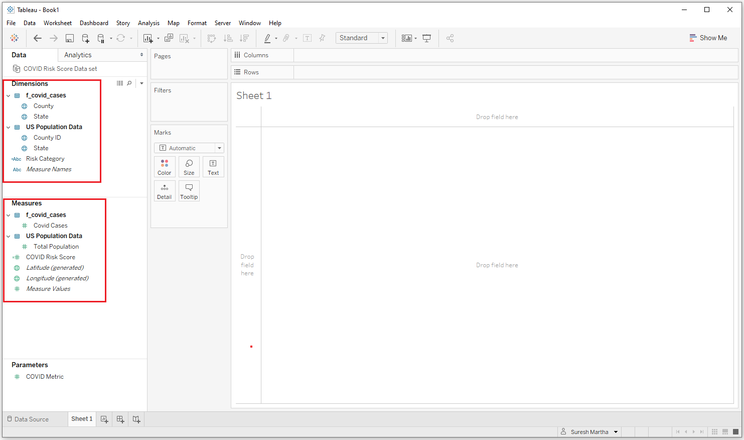 Figure 5: Tableau Development worksheet area, where columns from the data sets are automatically added into the dimensions and measures pane.
Tableau Geocoding
Tableau geocoding is another excellent feature provided by Tableau. Tableau can geocode from eight different types of geographic information such as fields like country, state, province, city, postal codes, etc. plus latitude and longitude coordinates. The geographic field is denoted by a small globe icon. Tableau automatically generates the longitude and latitude values for the center points of each geographic entity displayed in the visualization [2,4]. Along with it, users can also customize geocodes by assigning latitude and longitude coordinates to their locations so Tableau can plot them accurately on a map. In this paper, a filled map is used to create the visual dashboard.
Risk Score Modeling
The first data set used is the open-source COVID infection data, the last seven days’ worth of data has been uploaded into the Redshift table and connected to Tableau through the AWS Tableau connector. The second data set is the US census bureau data for population details, which is connected to Tableau through the excel file. Both the data sets are joined using the unique county column present in both data sets.
Finally, a calculated column named ‘COVID risk score’ is created by calculating the last seven days of COVID cases per 100K population in a county (Figure 6). The risk scores are divided into three categories — high, medium, and low risk based on the number of COVID cases in the last seven days per 100K population. The three categories are used to create another calculated column to divide the categories into three color segments based on the below definitions and the field is named ‘Risk Category’.
COVID Risk Score Definitions for colored risk categories:
- High Risk Red Color COVID Risk Score >100 COVID cases in the last seven days per 100K Population
- Medium Risk Yellow Color COVID Risk Score between 40 and 100 COVID cases in the last seven days per 100K Population
- Low Risk Green Color COVID Risk Score < 40 COVID cases in the last seven days per 100K Population

Figure 6: COVID Risk Score logic.
Results
Basic View
A horizontal bar chart is created to show the risk score for each state by county. First, the fields ‘State’ and ‘County’ in the ‘Dimensions’ pane are dragged and dropped into the ‘Rows’ shelf. As these are the dimension fields, they are displayed in blue color. Then the 'COVID Risk Score' field under the ‘Measures’ pane is dragged and dropped into the 'Columns' shelf. This field is displayed in green, and tableau automatically denotes it with the default aggregate function 'sum' as it is a numeric field, which can be changed based on the users’ needs such as max, min, etc. This shows the risk score for each of the counties in a bar graph (Figure 7).
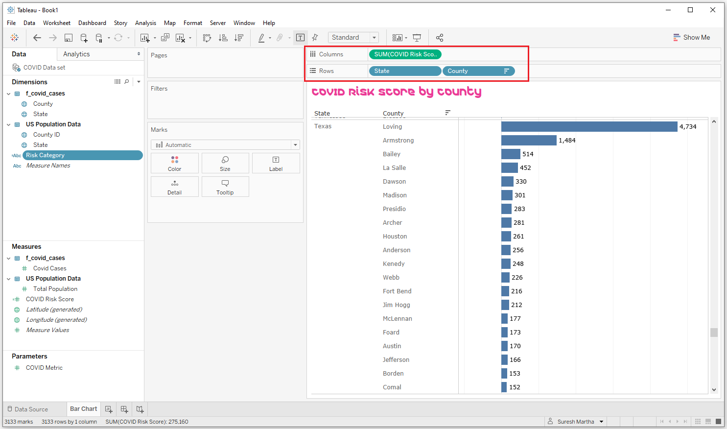 Figure 7: Tableau desktop worksheet showing the horizontal Bar chart for the selected fields.
Filtering the View and Understanding the Highest Risk Score
Figure 7 is showing all the data for all the fields that have been dragged and dropped into the view. Now, the view could be enhanced with interactive features by using filters and mark cards. For the filters, ‘State’, ‘County’, and ‘Risk Category’ fields from the Dimensions pane are dragged and dropped into the ‘Filters’ shelf. Next, the ‘Risk Category’ is dropped into the ‘Color’ of the mark cards, followed by ‘COVID Risk Score’, ‘COVID Cases’, and ‘Total Population’ fields dragged and dropped from the Dimensions pane into the ‘Label’ of the mark cards as highlighted below in Figure 8. This development area worksheet could now be moved into a formal dashboard section.
Figure 9 is an example of the visual dashboard where some filters have been applied. The fields on the ‘Label’ would help to create the hover information, that is when the mouse hovers over a bar, it shows additional information in a pop-up box about the selected bar as shown in Figure 9.
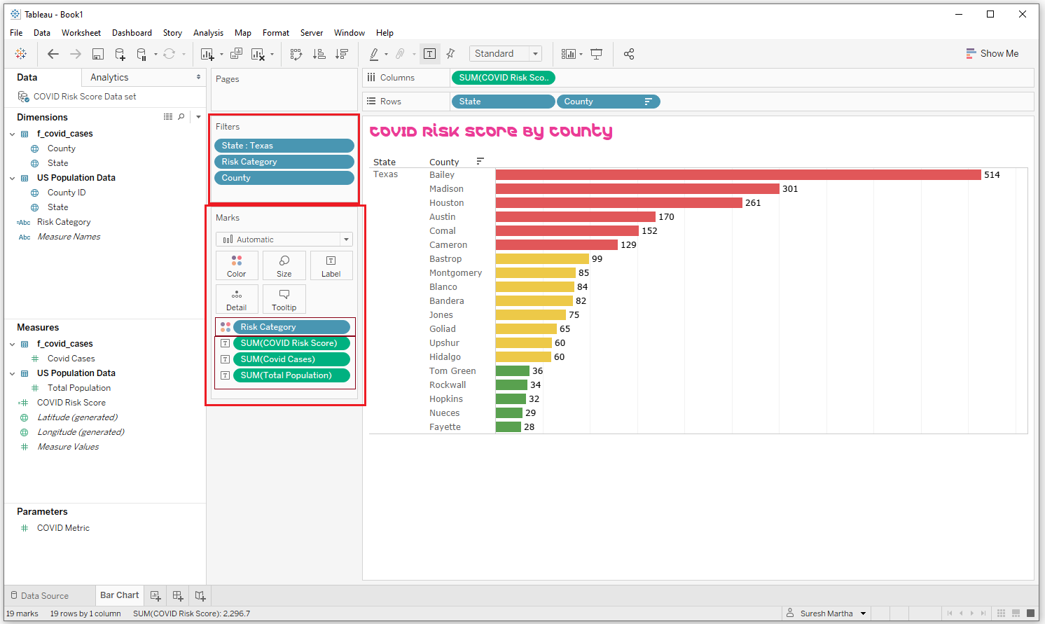 Figure 8: Highlights the Filter and Mark card shelves used to enhance the visualization.
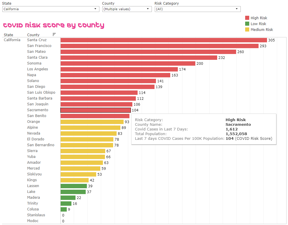
Figure 9: Example of filtering and showing the features of Mark Card in a dashboard.
Building a Map View
The view is created using the Tableau-generated latitude and longitude coordinates along with the state column from the data set. In the tableau development area, a new worksheet is selected and the field ‘State’ from the Dimensions pane is dragged and dropped into the ‘Detail’ of the mark cards. Tableau automatically drags and drops Longitude and Latitude fields from the ‘Measures’ pane on the ‘Columns’ and ‘Rows’ shelves respectively and creates a map. ‘Show me’ shows two options for map view filled or symbol. In this case, the Filled map is selected for the visualization.
State is added to the filter shelf like in the previous view. For the quantitative measure, both the ‘COVID Risk Score’ and total ‘COVID Cases’ are to be shown on the map by State. So, a parameter ‘COVID Metric’ is created to toggle between 2 measures ‘COVID Risk Score’ and ‘COVID Cases’. This parameter is used to create a calculated column ‘Metric’ (Figure 10), which is dragged and dropped onto the ‘color’ of the mark cards. Then the color in the mark card is selected and from the color list ‘Red-Blue’ diverging is selected, and ‘Reversed’ is checked. So, that high score or high cases would show in red color and the reverse would show in blue color.
Figure 11 is showing the visualization with the parameter filter ‘COVID Metric’ where the current default selection is ‘COVID Risk Score’ (i.e., New COVID infection cases in the last seven days per 100K population in the state), and the map is shaded with the risk score numbers for each state. The color shading for the states in the map is changed when the parameter filter is changed to the ‘COVID Cases’ to show the total COVID cases in the last seven days by State.
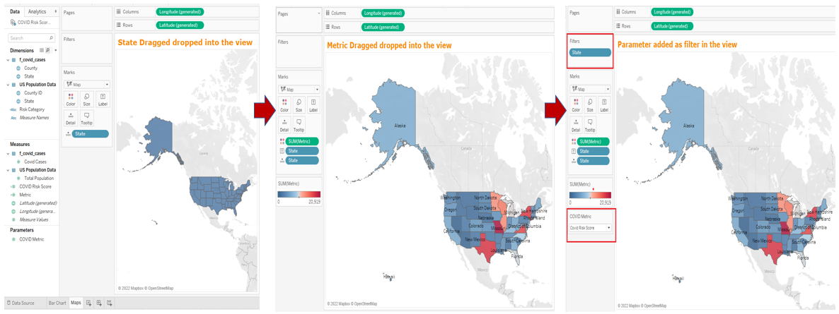
Figure 10: Steps for creating the Map view.
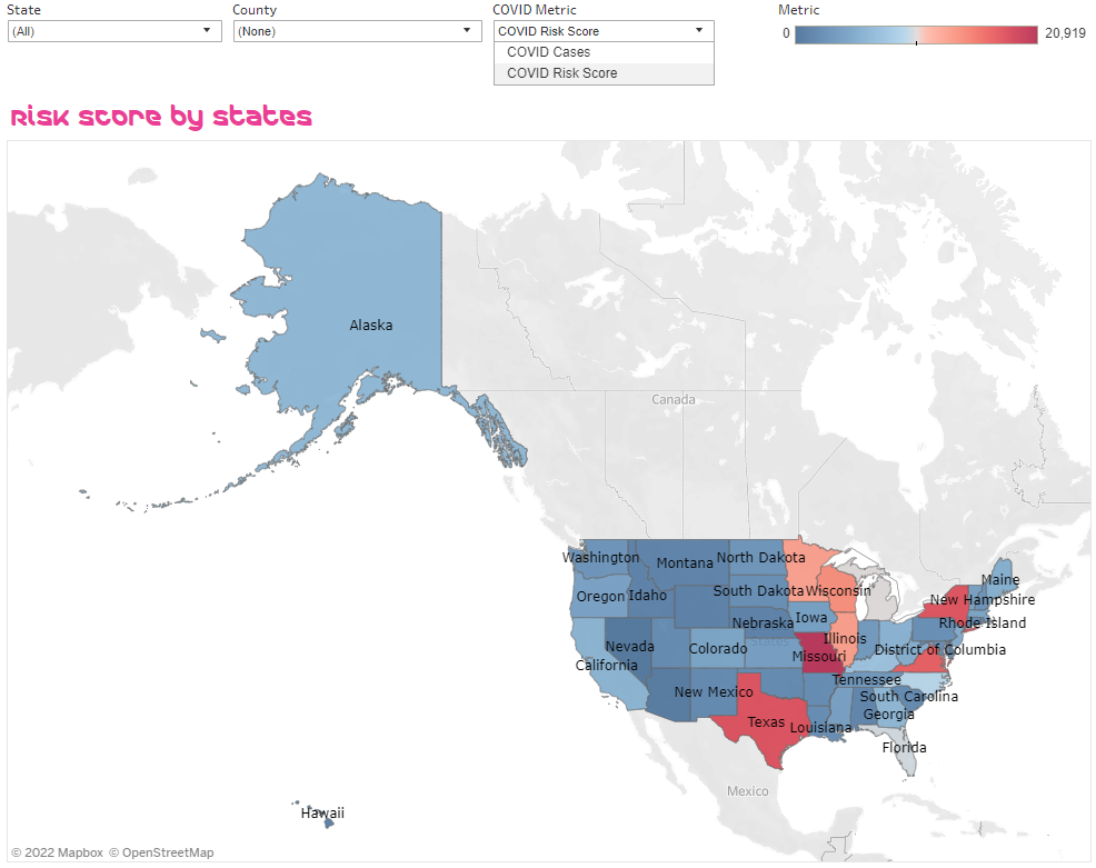 Figure 11: Filled Map with US states shaded according to the sum of either COVID Cases or COVID Risk score based on the metric selected in the ‘COVID Metric’ filter.
Conclusion
Users’ ability to perceive data is enhanced significantly when data or information is presented in a visual format. It becomes difficult to miss out on important insights. Visual display of data always would have a significant advantage over regular tabular format data. And in today’s post-COVID world, industries are showing a great interest in data analytics through visualizations. Tableau, being a powerful visual analytics tool, could be used to create impactful visualizations by harnessing a massive amount of data through various data sources, which could help users to see, understand, and explore the data.
It is loaded with user-friendly and state-of-the-art features and world-class functionalities that could help to extract valuable insights, which could be analyzed through interactive visualizations. In this paper, I used data from two different data sources and merged them together in the Tableau layer to perform the data analysis and create interactive visual dashboards.
References
- McGrail S. Impact of Medical Affairs on the Pharmaceutical Industry. Pharma News Intelligence. 2021. Available at: https://pharmanewsintel.com/news/impact-of-medical-affairs-on-the-pharmaceutical-industry.
- Daniel G. Murray, with the InterWorks Team. "Tableau Your Data! Fast and Easy Visual Analysis with Tableau Software", Published by John Wiley & Sons, Inc. ISBN: 978-1118612040
- S Narula, A Jain and M Prachi. (2015). "Cloud computing security: Amazon Web service", IEEE 5th Int. Conf. Adv. Comput. Commun. Technol, 501-505.
- Nikhat A, Nazia T, Dr. Asif P and Dr. Yusuf P. (2020). Data analytics and visualization using Tableau utilitarian for COVID19 (Coronavirus). Global Journal of Engineering and Technology Advances, 2020, 10.30574/gjeta.2020.3.2.0029ff. Hal-03226643f
- Alexander Loth (2019). “Visual Analytics with Tableau”, Published by John Wiley & Sons, Inc. ISBN: 978-1119560203
- COVID-19 Infection data. Public data provided by New York Times [Internet] https://github.com/nytimes/covid-19-data
- US Census Bureau Population Data. [Internet] Government Website: https://www.census.gov/data.html
- Sas, "Data Visualization Techniques" (2013). White Paper
- Ward, M., Grinstein, G., Keim, D. “Interactive Data Visualization: Foundations, Techniques, and Applications”, Published by A. K. Peters, Ltd., Natick (2010). ISBN: 9780429108433
- TABLEAU SOFTWARE, LLC, A SALESFORCE COMPANY. www.tableau.com [Internet]. Downloading a trial of Tableau Desktop. Available from https://www.tableau.com/products/desktop
- TABLEAU SOFTWARE, LLC, A SALESFORCE COMPANY. www.tableau.com [Internet]. Downloading Tableau Desktop for Students. Available from https://www.tableau.com/academic/students
- TABLEAU SOFTWARE, LLC, A SALESFORCE COMPANY. www.tableau.com [Internet]. Downloading Tableau Desktop for education professionals. Available from https://www.tableau.com/academic/teaching
- Inseok Ko & Hyejung Chang (2017). "Interactive Visualization of Healthcare Data Using Tableau". Healthcare Informatics Research 2017; 23(4): 349-354. DOI: https://doi.org/10.4258/hir.2017.23.4.349
- Dr. Yusuf P, Firoj P and Nikhat A. (2014). “A Posteriori Perusal of Mobile Computing”, International Journal of Computer Applications Technology and Research (IJCATR), ATS (Association of Technology and Science), ISSN 2319–8656 (Online), 3(9), 569 – 578
- David McNaughton & Janice Light (2013). “The iPad and Mobile Technology Revolution: Benefits and Challenges for Individuals who require Augmentative and Alternative Communication, Augmentative and Alternative Communication”, 29:2, 107-116, DOI: 10.3109/07434618.2013.784930
Opinions expressed by DZone contributors are their own.

Comments