Creating Bar Chart Race: The Futuristic Data Representation Model
I am not here to take a dig at the certifications without implementations, but to talk about one thing that caught my attention. That's the Bar Chart Race.
Join the DZone community and get the full member experience.
Join For FreeEvery now and then, we scroll through different professional networking sites like the one which enables us to be LinkedIn these unprecedented times. The most common type of posts on these websites are the ones with the certifications. Although, none of them comes with any sort of implementation.
But don't worry folks, I am not here to take a dig at the certifications without implementations. I am here to talk about one thing that caught my attention. That's the Bar Chart Race.
It looks like this:
I am sure this caught your attention too! This looks amazing and more importantly, gives an in-depth analysis in minutes that would anyway take hours of meeting and over a dozen slides with a speaker touring you down to the Dreamland as if he's singing a lullaby for you.
No worries! Bar Chart Race is here to save your day.
A Brief History
Frankly speaking, (writing) there is no history of bar chart race. No one knows who invented this and surprisingly no one has ever claimed its invention.
All it took was a tweet.
WOAH...!
— Matt Navarra (@MattNavarra) February 21, 2019
Top 15 BEST global brands ranking for the last 19 years...
Watch big name tech companies take-over at the end!
h/t @Interbrand pic.twitter.com/oRdO7QH6js
This tweet broke the internet. Everyone's asking how to make these types of 'HorseRace' kind of a thing. Yess.... they didn't even know its name back then. It rapidly gained momentum and the tweet racked up thousands of likes and retweets.
Around a month later, another tweet from a journalist surprisingly came with a detailed code to build the bar chart race.
New project:
A “Bar Chart Race” animation showing the changing ranks of the 10 biggest cities in the world since 1500.
Fascinating to watch giant cities vanish after falling in conquests, and amazing that three UK cities were in the top 8 in the late 1800s. pic.twitter.com/KglMZbYobr— John Burn-Murdoch (@jburnmurdoch) March 18, 2019
Notes:
— John Burn-Murdoch (@jburnmurdoch) March 18, 2019
• Full code for the animation here on @observablehq https://t.co/dQzIyU9Jlp
• I’ve tried to build this in a fairly reproducible way, such that you give it a dataset containing entity, year, value, and it does the rest
• Feedback welcome!#dataviz
Suddenly Bar Chart races were everywhere — Youtube, Twitter, Instagram. People came with different data domains and presented their Bar Chart Race in different ways.
How to Make One?
There are many platforms available that can be used to develop your own custom Bar Chart Race. Some of them include Tableau software, Flourish Studio, and bar-chart-race library for Python. Some of them even advertise their product with - NO CODING REQUIRED.
Well...making a bar chart race doesn't need any skill. Just add your DATAto one of the above platforms and your bar chart race is ready to download or share. But wait, where is the data?
As the above video shows, this bar chart race is based on the Olympics data. So, the heart of the matter is that the data should be in a particular format to be understood by these platforms. This makes one thing clear and that is — you cannot do it without CODING (until you have the pre-processed data)as the data needs to be in the specific format which can be interpreted by these platforms.
We will be using Python's Pandas to process the data to be loaded into the bar chart race platforms. For this demonstration, we will be using the Flourish Studio.
Approach
For our readers, we would be taking a sample data set which is not at all processed and can be called the Raw Data. The data can be downloaded from here.
Firstly, we will look at the detailed architecture followed by the step by step explanation.
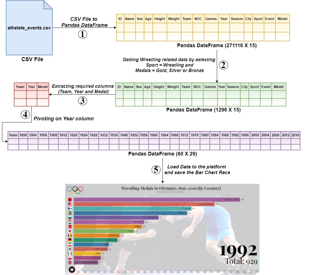
Put on Your Coding Hats!
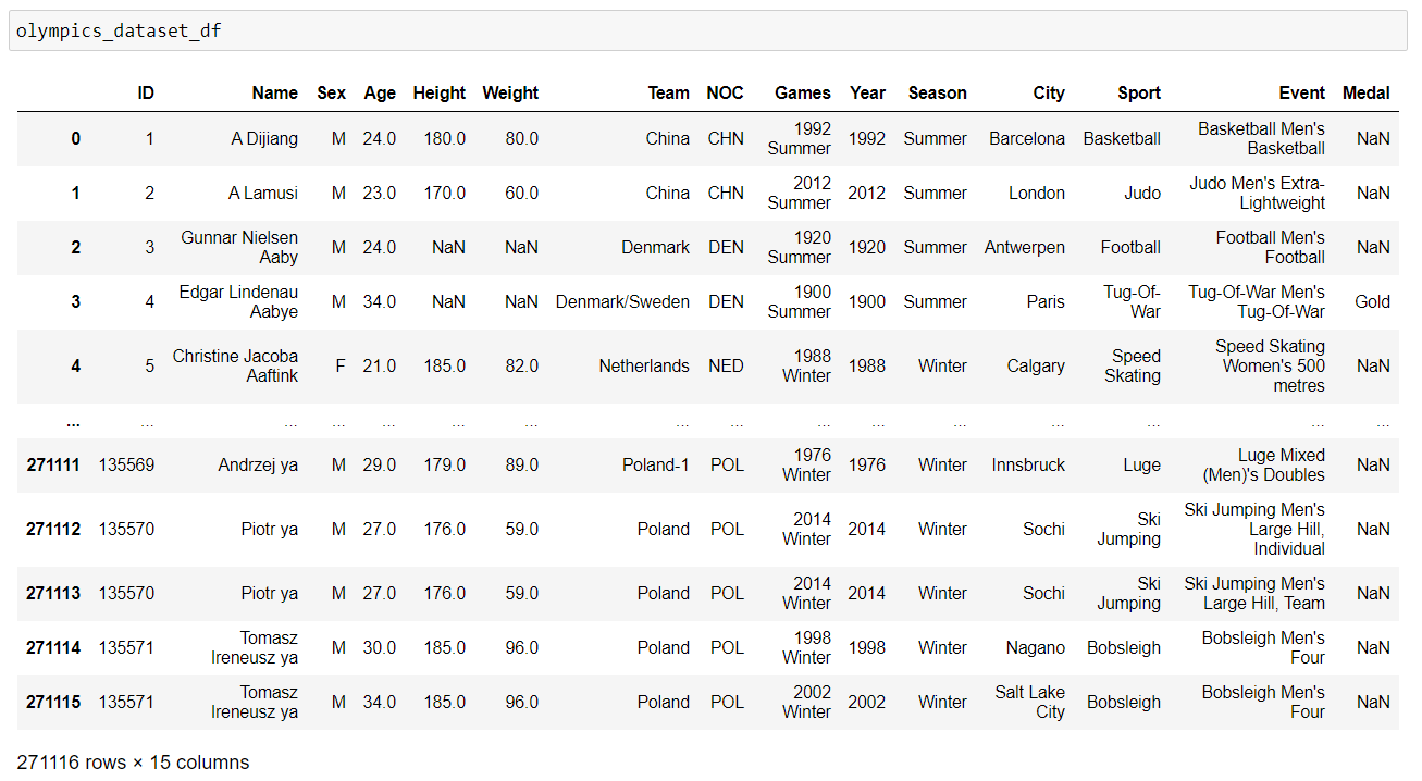
Step 1: CSV File to Pandas Dataframe
First of all, we would need to convert the downloaded athlete_events.csvfile to a pandas DataFrame.
x
import pandas as pd
# Read csv and store in a dataframe
olympics_dataset_df = pd.read_csv('https://raw.githubusercontent.com/mudit111/bar-chart-race/master/athlete_events.csv')
Step 2: Filtering the Wrestling Data
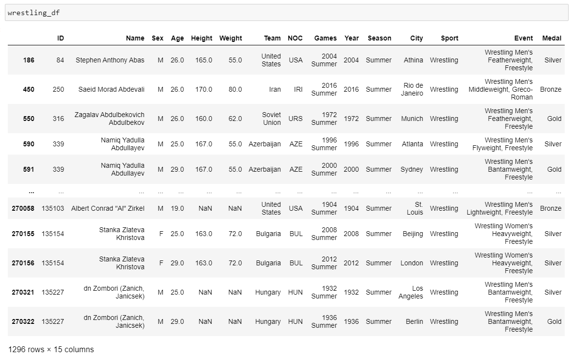
Now, we will filter the olympics_dataset_dfto get the data related to Wrestling.
x
# Filter wrestling data
wrestling_df = olympics_dataset_df[olympics_dataset_df['Sport']=='Wrestling'][olympics_dataset_df.Medal.isin(['Gold','Silver','Bronze'])]
Step 3: Extracting Required Columns
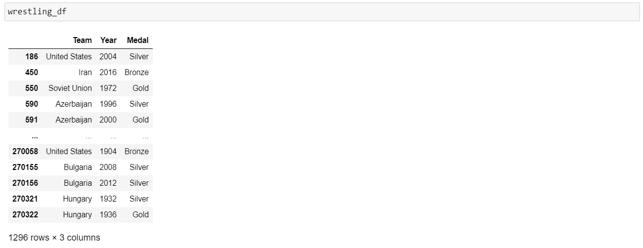
As we are ready with the wrestling data, we would now eliminate the insignificant columns.
x
# Filter the dataframe columns to select the relevant columns
wrestling_df = wrestling_df[['Team','Year','Medal']]
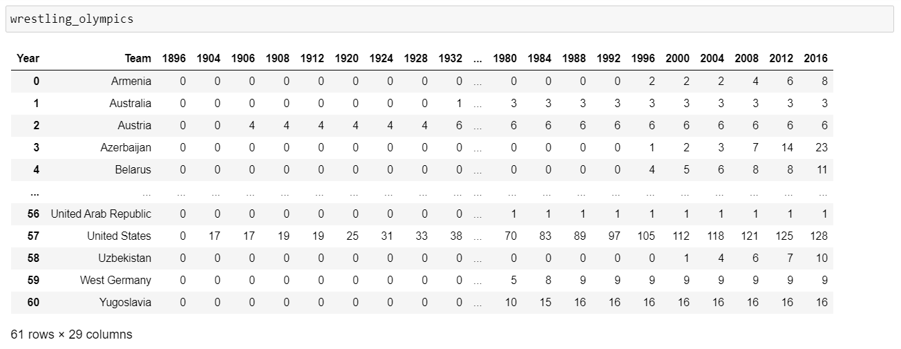
Step 4: Pivoting the DataFrame
This is a bit complex and a very important step. The DataFrame undergo schema changes in this transformation. (pivot)
x
# Pivot dataframe
wrestling_olympics = wrestling_df.groupby(['Team','Year']).count().reset_index().pivot(index='Team',columns='Year',values='Medal').fillna(0).astype(int).reset_index()
# Looping through the columns and adding the previous column to each column
previous_year = wrestling_olympics.columns[1]
for year in wrestling_olympics.columns[2:]:
wrestling_olympics[year] = wrestling_olympics[previous_year] + wrestling_olympics[year]
previous_year = year
Step 5: Loading the Data
This is the final step we all have been waiting for i.e to load the data on Flourish and get our Bar Chart Race ready to jiggle on our computer screens.
GitHub Repository for the code.
That's it for this blog. Do share your unique bar chart races in the comments section and let me know if you find any difficulty in designing them.
Thanks for reading.
Opinions expressed by DZone contributors are their own.

Comments